Edd Hopkinson
Senior Designer
Improving clarity and conversion
Redesigning the broadband experience to clarify content, reduce friction, and drive measurable impact.
Research
Strategy
UX/UI
Design System
Content Design
Collaboration
Completed @ Vodafone
The Problem
As new products and messaging were layered onto Vodafone’s broadband pages over time, the experience became increasingly complex and inconsistent. With further launches planned, this complexity was compounding.
The broadband journey showed clear signs of structural drift.
Users struggled to:
- Compare plans clearly
- Understand tangible product benefits
- Navigate dense, technical content
In addition:
- Visual hierarchy varied across pages
- Messaging prioritised features over clarity
- Design system inconsistencies began to appear
The section had grown organically, but without a unifying structure. While the right information existed, it was not organised in a way that supported confident decision-making.
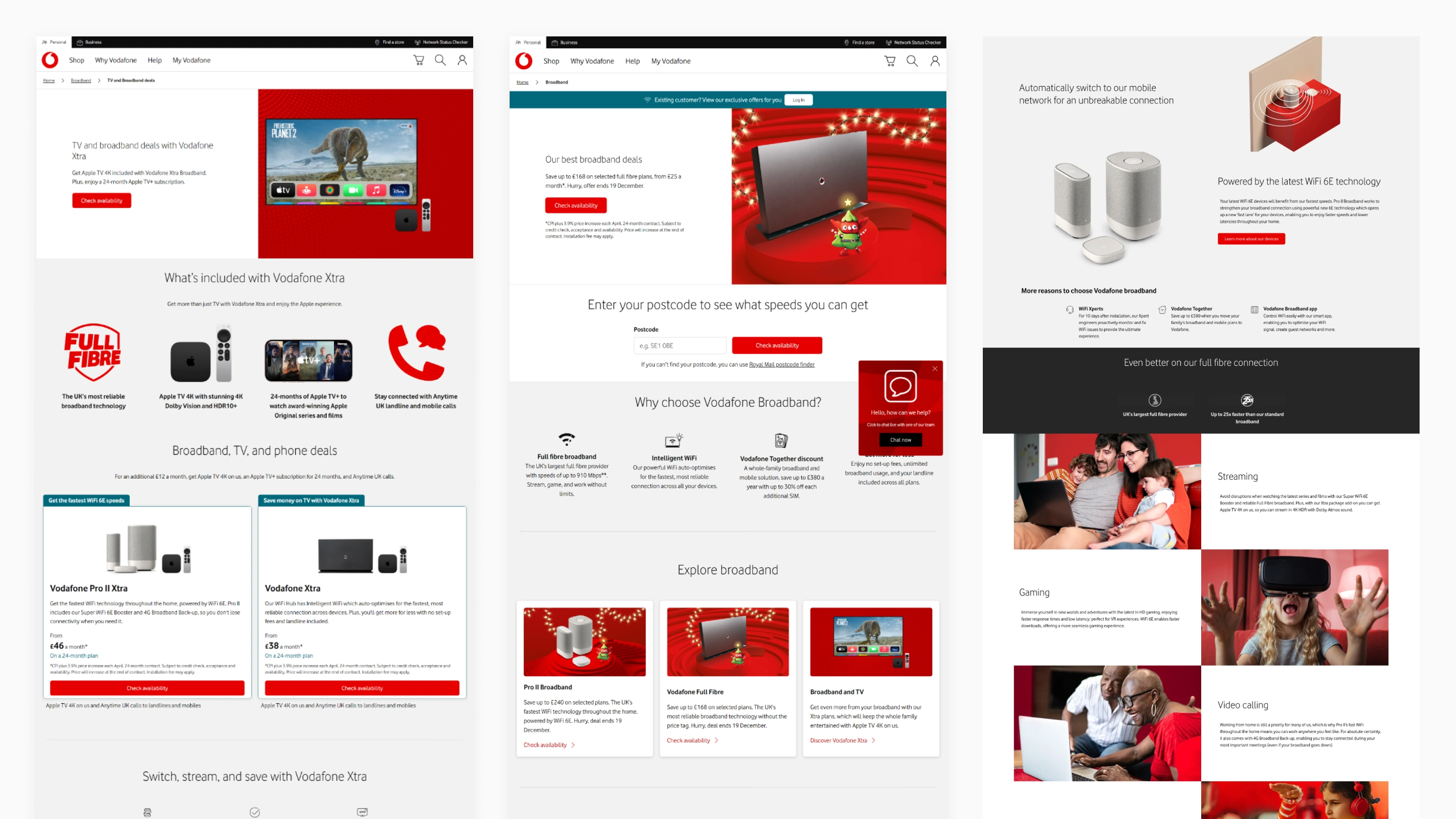
Constant content additions, poor hierarchy, and inconsistent design system implementation reduced clarity across the section making it feel disjointed.
My Role
I worked closely with product managers, the content team, and researchers to redesign the broadband marketing section.
My focus was to:
- Analyse behavioural data and pain points
- Restructure content and hierarchy
- Reduce cognitive load and improve clarity
- Apply and validate the emerging design language
Research and Insight
To understand how this structural complexity was affecting behaviour, I analysed performance data, stakeholder feedback, and interaction patterns across the journey.
The issue was not information volume alone. It was how that information was structured and processed.
A consistent pattern emerged:
- Users hesitated at plan comparison
- Dense content increased cognitive effort
- Feature-led messaging diluted perceived value
Users were not lacking information. They were lacking clarity at critical decision moments.
This reframed the redesign from a visual clean-up to a structural intervention aimed at reducing decision friction.
Users struggled with plan selection when the content implied they were making a selection.

Technical feature-led content made it hard to understand tangible user benefits.
High content density, inconsistent hierarchy, and poor spacing increased cognitive effort.
Hypothesis
Based on these insights, we formed a working hypothesis:
IF the section was restructured around clarity, comparison, and user benefit,THEN users will be able to compare plans more confidently,LEADING TO improved progression through the funnel.
Key Design Changes
The redesign focused on simplifying structure, prioritising comparison, and aligning the experience around customer benefits and intent rather than product marketing.
Rather than adding new elements, the work centred on refining what already existed, and allowing the section to be scalable for future content updates.
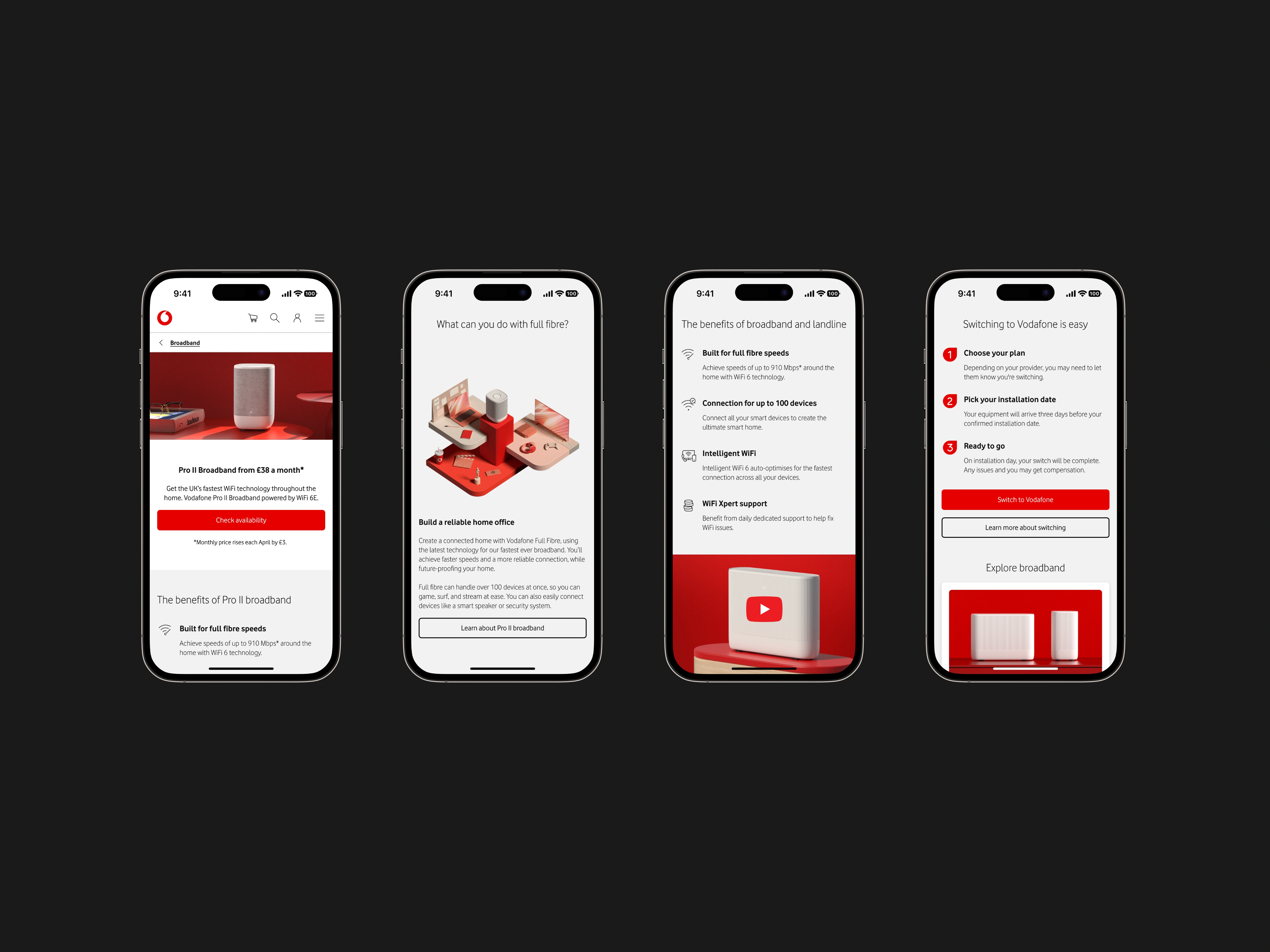
Strengthening structure and visual hierarchy
Inconsistent layouts made it difficult to understand what mattered most.
Using spacing, typography, and layout principles from the design language, I introduced repeatable structural patterns across the section.
This reduced visual noise and improved scanability by:
- Establishing stronger typographic hierarchy
- Creating predictable content groupings
- Removing competing visual emphasis
- Giving content room to breathe
Structural simplification and consistent typographic hierarchy was introduced to the section before visual refinement.
Reframing content around user benefit
The existing content emphasised brand messaging and product jargon. I rebuilt the hierarchy around user benefits and how users explore broadband options.
This included:
- Using SEO data to inform heading hierarchy
- Removing redundant content
- Rewriting headings for clarity and scanability
- Shifting from technical jargon to tangible benefits
- Structuring sections around meaningful user search queries
The result was content that felt clearer, more relevant, and easier to navigate.
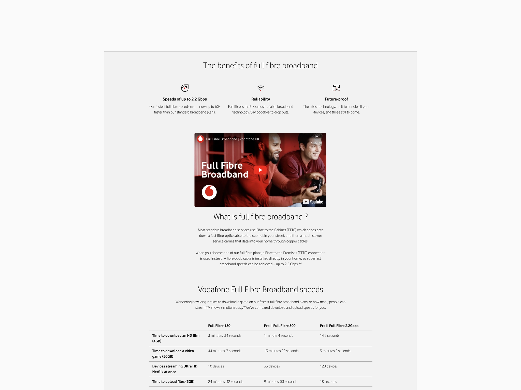
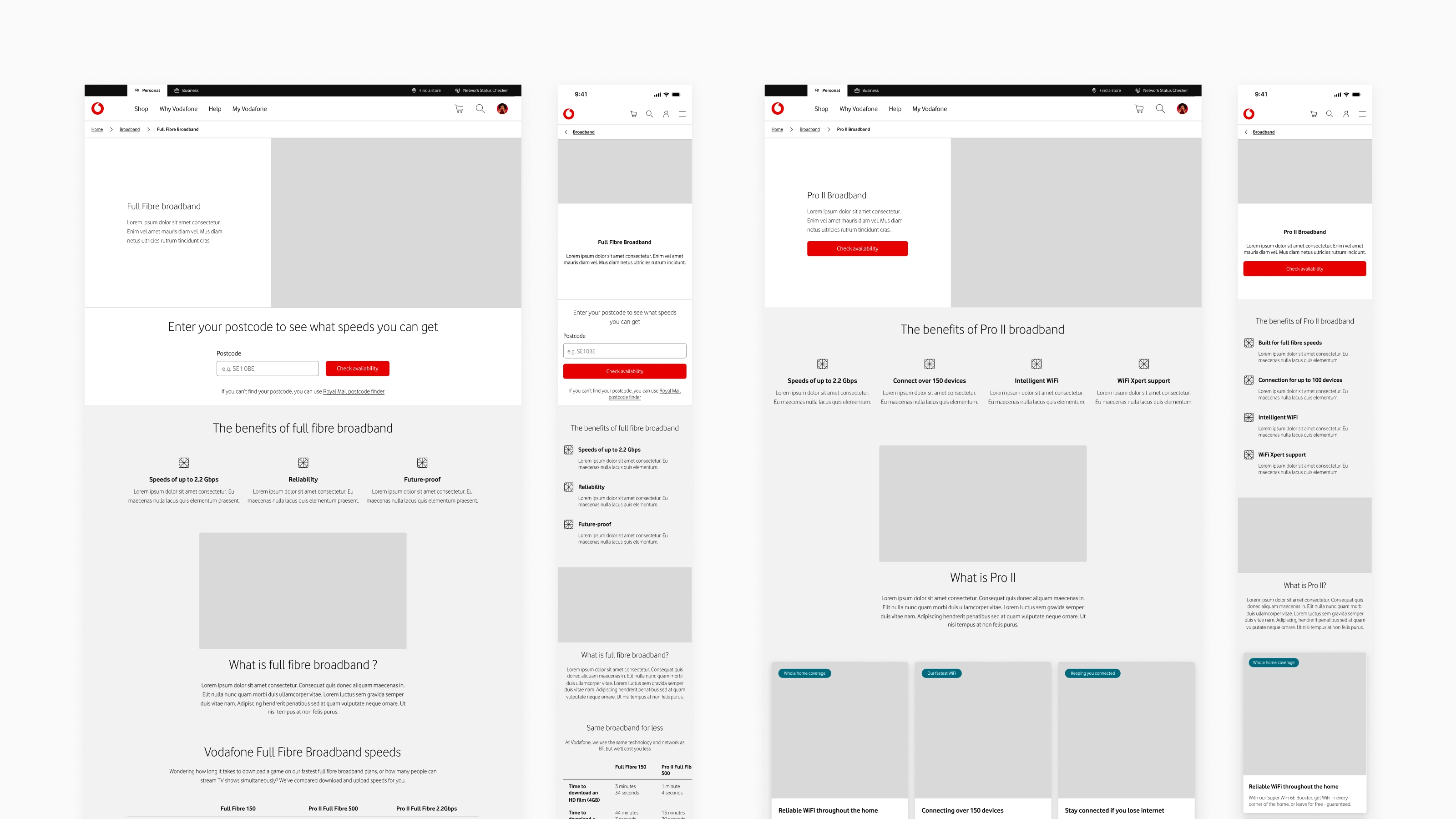
Headings built around SEO data and structured to support scanability and clarity.
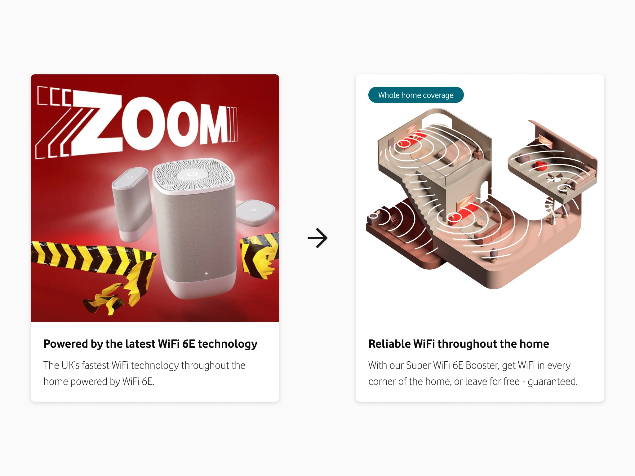
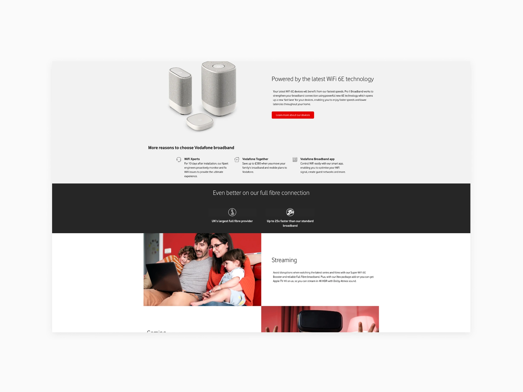
Content was reorganised around user benefit rather than meaningless product features. Brand visuals were replaced with descriptive illustrations to support the copy.
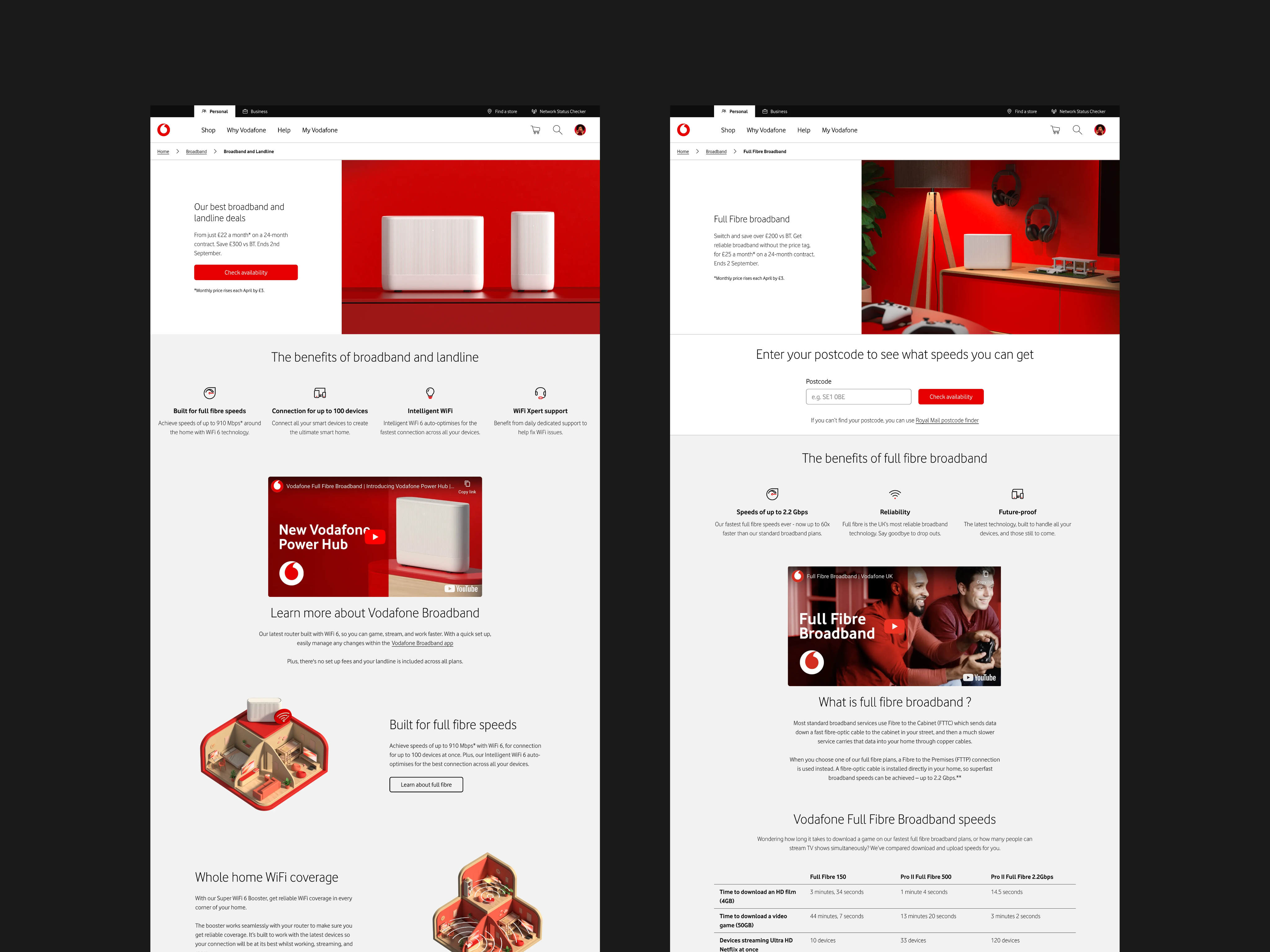
Prioritising plan comparison
Plan comparison was repositioned as the central decision-making moment.
To support this shift, I:
- Reframed user expectation from product selection to product comparison
- Categorised plan information into consistent, benefit-led sections
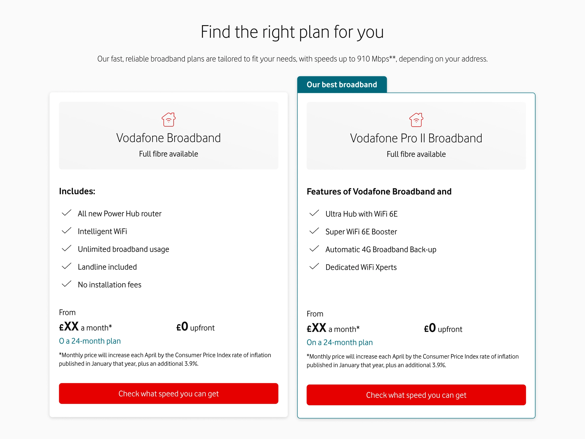
- Introduced a structured comparison table component replacing product cards
This made differences between plans easier to evaluate and supported more confident decision making.
These changes directly contributed to a +10.9% uplift in basket progression.
Before: Poor content and component choice led user to believe they were making a product selection, when they were really comparing plans at this stage.
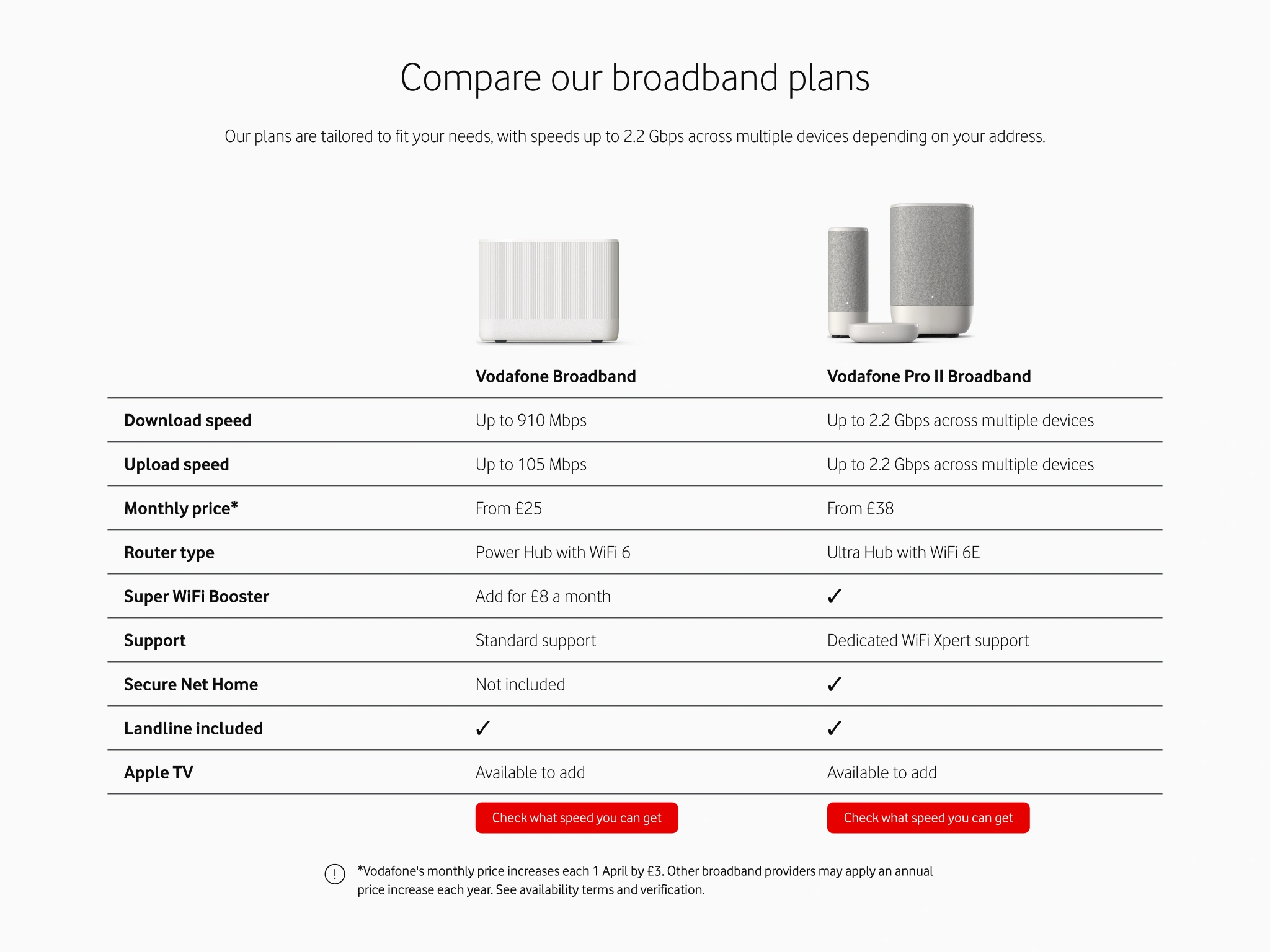
After: Using a structured comparison table component and reframing the content around comparison enabled faster and more confident plan comparison.
Applying a consistent visual language
The redesign also acted as a live validation of Vodafone’s emerging design language.
By applying shared layout and component patterns consistently, the broadband section became more cohesive and aligned with the wider design strategy.
This strengthened design system adoption internally while creating a more unified experience for customers.
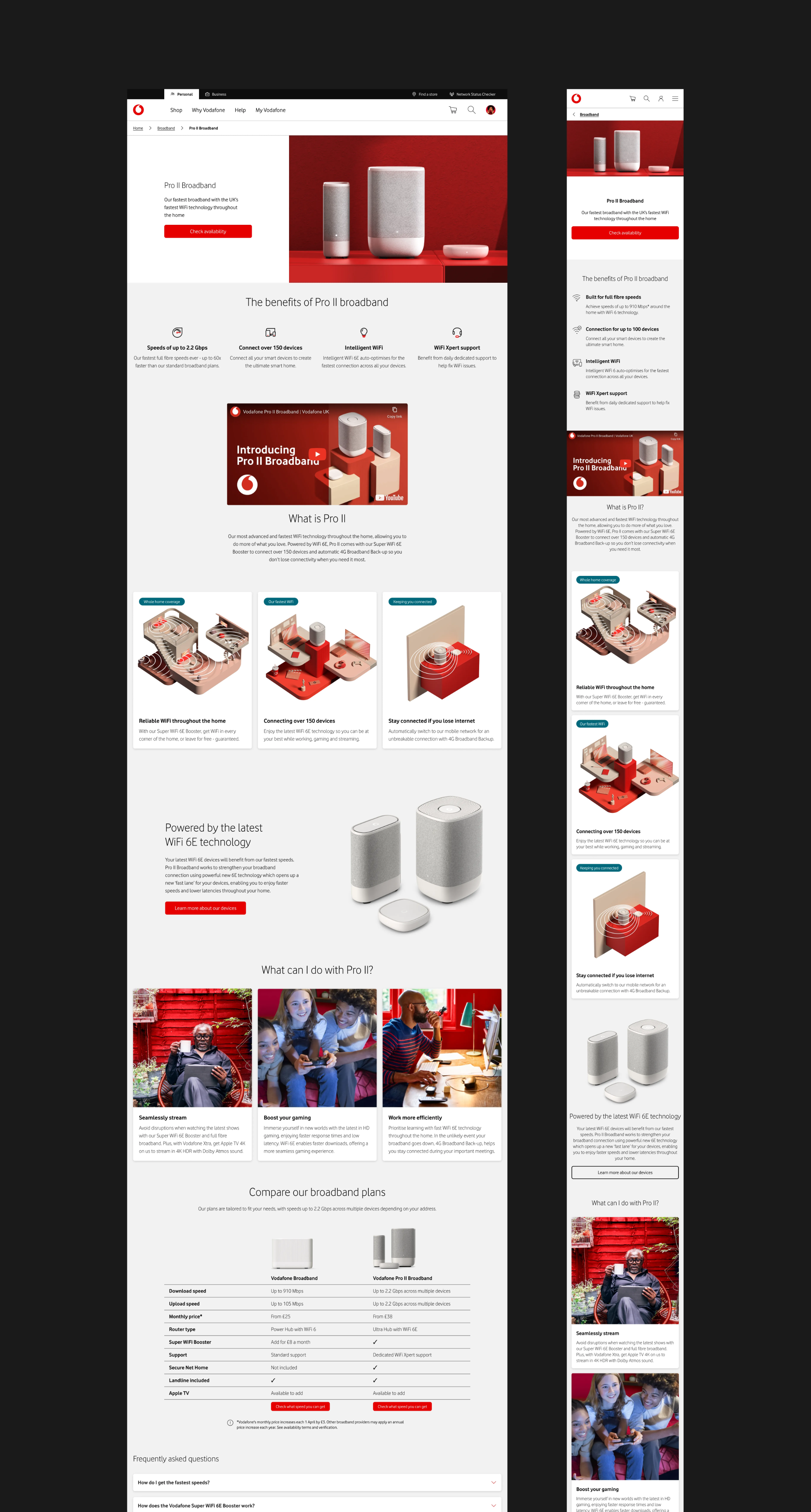
Reusable structural patterns enabling scalable product launches.
Consistent typographic hierarchy supporting scanning of content.
Consistent visual language and shared components across the section support clarity and design language alignment.
Impact
Following launch, performance improved measurably.
Quantitative impact
- +10.9% uplift in broadband basket progression
Qualitative impact
- Clearer plan comparison and improved decision confidence
- Stronger alignment with the emerging design language
- Increased consistency across the product portfolio
- Greater team confidence in system-led design decisions
The uplift validated the redesign and reinforced clarity as a driver of conversion.
Reflection
This project reinforced that clarity drives conversion. Structural simplification, when aligned with user behaviour and business goals, can produce measurable results.
It also demonstrated that a design language proves its value through application. The broadband redesign showed how system thinking translates into real product impact.
“Without Edd, the broadband content team would not function. His invaluable expertise within design is the reason why we have an amazing portfolio of broadband journeys.”
Jessica Shepherd
Head of Digital @ Vodafone
Edd Hopkinson
Senior Designer
© 2025 Edd Hopkinson
Edd Hopkinson
Senior Designer
Improving clarity and conversion
Redesigning the broadband experience to clarify content, reduce friction, and drive measurable impact.
Research
Strategy
UX/UI
Design System
Content Design
Collaboration
Completed @ Vodafone
The Problem
As new products and messaging were layered onto Vodafone’s broadband pages over time, the experience became increasingly complex and inconsistent. With further launches planned, this complexity was compounding.
The broadband journey showed clear signs of structural drift.
Users struggled to:
- Compare plans clearly
- Understand tangible product benefits
- Navigate dense, technical content
In addition:
- Visual hierarchy varied across pages
- Messaging prioritised features over clarity
- Design system inconsistencies began to appear
The section had grown organically, but without a unifying structure. While the right information existed, it was not organised in a way that supported confident decision-making.
Constant content additions, poor hierarchy, and inconsistent design system implementation reduced clarity across the section making it feel disjointed.
My Role
I worked closely with product managers, the content team, and researchers to redesign the broadband marketing section.
My focus was to:
- Analyse behavioural data and pain points
- Restructure content and hierarchy
- Reduce cognitive load and improve clarity
- Apply and validate the emerging design language
Research and Insight
To understand how this structural complexity was affecting behaviour, I analysed performance data, stakeholder feedback, and interaction patterns across the journey.
The issue was not information volume alone. It was how that information was structured and processed.
A consistent pattern emerged:
- Users hesitated at plan comparison
- Dense content increased cognitive effort
- Feature-led messaging diluted perceived value
Users were not lacking information. They were lacking clarity at critical decision moments.
This reframed the redesign from a visual clean-up to a structural intervention aimed at reducing decision friction.
Users struggled with plan selection when the content implied they were making a selection.
Technical feature-led content made it hard to understand tangible user benefits.
High content density, inconsistent hierarchy, and poor spacing increased cognitive effort.
Hypothesis
Based on these insights, we formed a working hypothesis:
IF the section was restructured around clarity, comparison, and user benefit,THEN users will be able to compare plans more confidently,LEADING TO improved progression through the funnel.
Key Design Changes
The redesign focused on simplifying structure, prioritising comparison, and aligning the experience around customer benefits and intent rather than product marketing.
Rather than adding new elements, the work centred on refining what already existed, and allowing the section to be scalable for future content updates.
Strengthening structure and visual hierarchy
Inconsistent layouts made it difficult to understand what mattered most.
Using spacing, typography, and layout principles from the design language, I introduced repeatable structural patterns across the section.
This reduced visual noise and improved scanability by:
- Establishing stronger typographic hierarchy
- Creating predictable content groupings
- Removing competing visual emphasis
- Giving content room to breathe
Structural simplification and consistent typographic hierarchy was introduced to the section before visual refinement.
Reframing content around user benefit
The existing content emphasised brand messaging and product jargon. I rebuilt the hierarchy around user benefits and how users explore broadband options.
This included:
- Using SEO data to inform heading hierarchy
- Removing redundant content
- Rewriting headings for clarity and scanability
- Shifting from technical jargon to tangible benefits
- Structuring sections around meaningful user search queries
The result was content that felt clearer, more relevant, and easier to navigate.
Headings built around SEO data and structured to support scanability and clarity.
Content was reorganised around user benefit rather than meaningless product features. Brand visuals were replaced with descriptive illustrations to support the copy.
Prioritising plan comparison
Plan comparison was repositioned as the central decision-making moment.
To support this shift, I:
- Reframed user expectation from product selection to product comparison
- Categorised plan information into consistent, benefit-led sections
- Introduced a structured comparison table component replacing product cards
This made differences between plans easier to evaluate and supported more confident decision making.
These changes directly contributed to a +10.9% uplift in basket progression.
Before: Poor content and component choice led user to believe they were making a product selection, when they were really comparing plans at this stage.
After: Using a structured comparison table component and reframing the content around comparison enabled faster and more confident plan comparison.
Applying a consistent visual language
The redesign also acted as a live validation of Vodafone’s emerging design language.
By applying shared layout and component patterns consistently, the broadband section became more cohesive and aligned with the wider design strategy.
This strengthened design system adoption internally while creating a more unified experience for customers.
Reusable structural patterns enabling scalable product launches.
Consistent typographic hierarchy supporting scanning of content.
Consistent visual language and shared components across the section support clarity and design language alignment.
Impact
Following launch, performance improved measurably.
Quantitative impact
- +10.9% uplift in broadband basket progression
Qualitative impact
- Clearer plan comparison and improved decision confidence
- Stronger alignment with the emerging design language
- Increased consistency across the product portfolio
- Greater team confidence in system-led design decisions
The uplift validated the redesign and reinforced clarity as a driver of conversion.
Reflection
This project reinforced that clarity drives conversion. Structural simplification, when aligned with user behaviour and business goals, can produce measurable results.
It also demonstrated that a design language proves its value through application. The broadband redesign showed how system thinking translates into real product impact.
“Without Edd, the broadband content team would not function. His invaluable expertise within design is the reason why we have an amazing portfolio of broadband journeys.”
Jessica Shepherd
Head of Digital @ Vodafone
Edd Hopkinson
Senior Designer
© 2025 Edd Hopkinson
Edd Hopkinson
Senior Designer
Improving clarity and conversion
Redesigning the broadband experience to clarify content, reduce friction, and drive measurable impact.
Research
Strategy
UX/UI
Design System
Content Design
Collaboration
Completed @ Vodafone
The Problem
As new products and messaging were layered onto Vodafone’s broadband pages over time, the experience became increasingly complex and inconsistent. With further launches planned, this complexity was compounding.
The broadband journey showed clear signs of structural drift.
Users struggled to:
- Compare plans clearly
- Understand tangible product benefits
- Navigate dense, technical content
In addition:
- Visual hierarchy varied across pages
- Messaging prioritised features over clarity
- Design system inconsistencies began to appear
The section had grown organically, but without a unifying structure. While the right information existed, it was not organised in a way that supported confident decision-making.
Constant content additions, poor hierarchy, and inconsistent design system implementation reduced clarity across the section making it feel disjointed.
My Role
I worked closely with product managers, the content team, and researchers to redesign the broadband marketing section.
My focus was to:
- Analyse behavioural data and pain points
- Restructure content and hierarchy
- Reduce cognitive load and improve clarity
- Apply and validate the emerging design language
Research and Insight
To understand how this structural complexity was affecting behaviour, I analysed performance data, stakeholder feedback, and interaction patterns across the journey.
The issue was not information volume alone. It was how that information was structured and processed.
A consistent pattern emerged:
- Users hesitated at plan comparison
- Dense content increased cognitive effort
- Feature-led messaging diluted perceived value
Users were not lacking information. They were lacking clarity at critical decision moments.
This reframed the redesign from a visual clean-up to a structural intervention aimed at reducing decision friction.
Users struggled with plan selection when the content implied they were making a selection.
Technical feature-led content made it hard to understand tangible user benefits.
High content density, inconsistent hierarchy, and poor spacing increased cognitive effort.
Hypothesis
Based on these insights, we formed a working hypothesis:
IF the section was restructured around clarity, comparison, and user benefit,THEN users will be able to compare plans more confidently,LEADING TO improved progression through the funnel.
Key Design Changes
The redesign focused on simplifying structure, prioritising comparison, and aligning the experience around customer benefits and intent rather than product marketing.
Rather than adding new elements, the work centred on refining what already existed, and allowing the section to be scalable for future content updates.
Strengthening structure and visual hierarchy
Inconsistent layouts made it difficult to understand what mattered most.
Using spacing, typography, and layout principles from the design language, I introduced repeatable structural patterns across the section.
This reduced visual noise and improved scanability by:
- Establishing stronger typographic hierarchy
- Creating predictable content groupings
- Removing competing visual emphasis
- Giving content room to breathe
Structural simplification and consistent typographic hierarchy was introduced to the section before visual refinement.
Reframing content around user benefit
The existing content emphasised brand messaging and product jargon. I rebuilt the hierarchy around user benefits and how users explore broadband options.
This included:
- Using SEO data to inform heading hierarchy
- Removing redundant content
- Rewriting headings for clarity and scanability
- Shifting from technical jargon to tangible benefits
- Structuring sections around meaningful user search queries
The result was content that felt clearer, more relevant, and easier to navigate.
Headings built around SEO data and structured to support scanability and clarity.
Content was reorganised around user benefit rather than meaningless product features. Brand visuals were replaced with descriptive illustrations to support the copy.
Prioritising plan comparison
Plan comparison was repositioned as the central decision-making moment.
To support this shift, I:
- Reframed user expectation from product selection to product comparison
- Categorised plan information into consistent, benefit-led sections
- Introduced a structured comparison table component replacing product cards
This made differences between plans easier to evaluate and supported more confident decision making.
These changes directly contributed to a +10.9% uplift in basket progression.
After: Using a structured comparison table component and reframing the content around comparison enabled faster and more confident plan comparison.
Before: Poor content and component choice led user to believe they were making a product selection, when they were really comparing plans at this stage.
Applying a consistent visual language
The redesign also acted as a live validation of Vodafone’s emerging design language.
By applying shared layout and component patterns consistently, the broadband section became more cohesive and aligned with the wider design strategy.
This strengthened design system adoption internally while creating a more unified experience for customers.
Reusable structural patterns enabling scalable product launches.
Consistent typographic hierarchy supporting scanning of content.
Consistent visual language and shared components across the section support clarity and design language alignment.
Impact
Following launch, performance improved measurably.
Quantitative impact
- +10.9% uplift in broadband basket progression
Qualitative impact
- Clearer plan comparison and improved decision confidence
- Stronger alignment with the emerging design language
- Increased consistency across the product portfolio
- Greater team confidence in system-led design decisions
The uplift validated the redesign and reinforced clarity as a driver of conversion.
Reflection
This project reinforced that clarity drives conversion. Structural simplification, when aligned with user behaviour and business goals, can produce measurable results.
It also demonstrated that a design language proves its value through application. The broadband redesign showed how system thinking translates into real product impact.
“Without Edd, the broadband content team would not function. His invaluable expertise within design is the reason why we have an amazing portfolio of broadband journeys.”
Jessica Shepherd
Head of Digital @ Vodafone
Edd Hopkinson
Senior Designer
© 2025 Edd Hopkinson
Edd Hopkinson
Senior Designer
Improving clarity and conversion
Redesigning the broadband experience to clarify content, reduce friction, and drive measurable impact.
Research
Strategy
UX/UI
Design System
Content Design
Collaboration
Completed @ Vodafone
The Problem
As new products and messaging were layered onto Vodafone’s broadband pages over time, the experience became increasingly complex and inconsistent. With further launches planned, this complexity was compounding.
The broadband journey showed clear signs of structural drift.
Users struggled to:
- Compare plans clearly
- Understand tangible product benefits
- Navigate dense, technical content
In addition:
- Visual hierarchy varied across pages
- Messaging prioritised features over clarity
- Design system inconsistencies began to appear
The section had grown organically, but without a unifying structure. While the right information existed, it was not organised in a way that supported confident decision-making.
Constant content additions, poor hierarchy, and inconsistent design system implementation reduced clarity across the section making it feel disjointed.
My Role
I worked closely with product managers, the content team, and researchers to redesign the broadband marketing section.
My focus was to:
- Analyse behavioural data and pain points
- Restructure content and hierarchy
- Reduce cognitive load and improve clarity
- Apply and validate the emerging design language
Research and Insight
To understand how this structural complexity was affecting behaviour, I analysed performance data, stakeholder feedback, and interaction patterns across the journey.
The issue was not information volume alone. It was how that information was structured and processed.
A consistent pattern emerged:
- Users hesitated at plan comparison
- Dense content increased cognitive effort
- Feature-led messaging diluted perceived value
Users were not lacking information. They were lacking clarity at critical decision moments.
This reframed the redesign from a visual clean-up to a structural intervention aimed at reducing decision friction.
Users struggled with plan selection when the content implied they were making a selection.
Technical feature-led content made it hard to understand tangible user benefits.
High content density, inconsistent hierarchy, and poor spacing increased cognitive effort.
Hypothesis
Based on these insights, we formed a working hypothesis:
IF the section was restructured around clarity, comparison, and user benefit,THEN users will be able to compare plans more confidently,LEADING TO improved progression through the funnel.
Key Design Changes
The redesign focused on simplifying structure, prioritising comparison, and aligning the experience around customer benefits and intent rather than product marketing.
Rather than adding new elements, the work centred on refining what already existed, and allowing the section to be scalable for future content updates.
Strengthening structure and visual hierarchy
Inconsistent layouts made it difficult to understand what mattered most.
Using spacing, typography, and layout principles from the design language, I introduced repeatable structural patterns across the section.
This reduced visual noise and improved scanability by:
- Establishing stronger typographic hierarchy
- Creating predictable content groupings
- Removing competing visual emphasis
- Giving content room to breathe
Structural simplification and consistent typographic hierarchy was introduced to the section before visual refinement.
Reframing content around user benefit
The existing content emphasised brand messaging and product jargon. I rebuilt the hierarchy around user benefits and how users explore broadband options.
This included:
- Using SEO data to inform heading hierarchy
- Removing redundant content
- Rewriting headings for clarity and scanability
- Shifting from technical jargon to tangible benefits
- Structuring sections around meaningful user search queries
The result was content that felt clearer, more relevant, and easier to navigate.
Headings built around SEO data and structured to support scanability and clarity.
Content was reorganised around user benefit rather than meaningless product features. Brand visuals were replaced with descriptive illustrations to support the copy.
Prioritising plan comparison
Plan comparison was repositioned as the central decision-making moment.
To support this shift, I:
- Reframed user expectation from product selection to product comparison
- Categorised plan information into consistent, benefit-led sections
- Introduced a structured comparison table component replacing product cards
This made differences between plans easier to evaluate and supported more confident decision making.
These changes directly contributed to a +10.9% uplift in basket progression.
Before: Poor content and component choice led user to believe they were making a product selection, when they were really comparing plans at this stage.
After: Using a structured comparison table component and reframing the content around comparison enabled faster and more confident plan comparison.
Applying a consistent visual language
The redesign also acted as a live validation of Vodafone’s emerging design language.
By applying shared layout and component patterns consistently, the broadband section became more cohesive and aligned with the wider design strategy.
This strengthened design system adoption internally while creating a more unified experience for customers.
Reusable structural patterns enabling scalable product launches.
Consistent typographic hierarchy supporting scanning of content.
Consistent visual language and shared components across the section support clarity and design language alignment.
Impact
Following launch, performance improved measurably.
Quantitative impact
- +10.9% uplift in broadband basket progression
Qualitative impact
- Clearer plan comparison and improved decision confidence
- Stronger alignment with the emerging design language
- Increased consistency across the product portfolio
- Greater team confidence in system-led design decisions
The uplift validated the redesign and reinforced clarity as a driver of conversion.
Reflection
This project reinforced that clarity drives conversion. Structural simplification, when aligned with user behaviour and business goals, can produce measurable results.
It also demonstrated that a design language proves its value through application. The broadband redesign showed how system thinking translates into real product impact.
“Without Edd, the broadband content team would not function. His invaluable expertise within design is the reason why we have an amazing portfolio of broadband journeys.”
Jessica Shepherd
Head of Digital @ Vodafone
Edd Hopkinson
Senior Designer
© 2025 Edd Hopkinson