Edd Hopkinson
Senior Designer
Surreal & Rawfunk visual identity
Creating an expressive visual identity that represents the artists and sound sympathetically.
Creative Concept
Visual Design
Visual Identity
Collaboration
Completed @ Freelance
Challenge
Drum & Bass production duo Surreal & Rawfunk wanted a visual identity that reflected the strength and power of their music while retaining a simple, recognisable aesthetic.
Concept
The identity is built around the idea of translating sound into a visual language. Morse code became a key reference point, as it was one of the earliest systems to convert audio into something readable. Rather than using Morse code directly, its principles were used as a starting point to develop a flexible visual system that can be used to respond to different intensities and moods within the music.
By linking audio cues to graphic form, the identity creates a clear connection between sound and image, ensuring the visual language feels embedded in the music rather than applied afterwards.
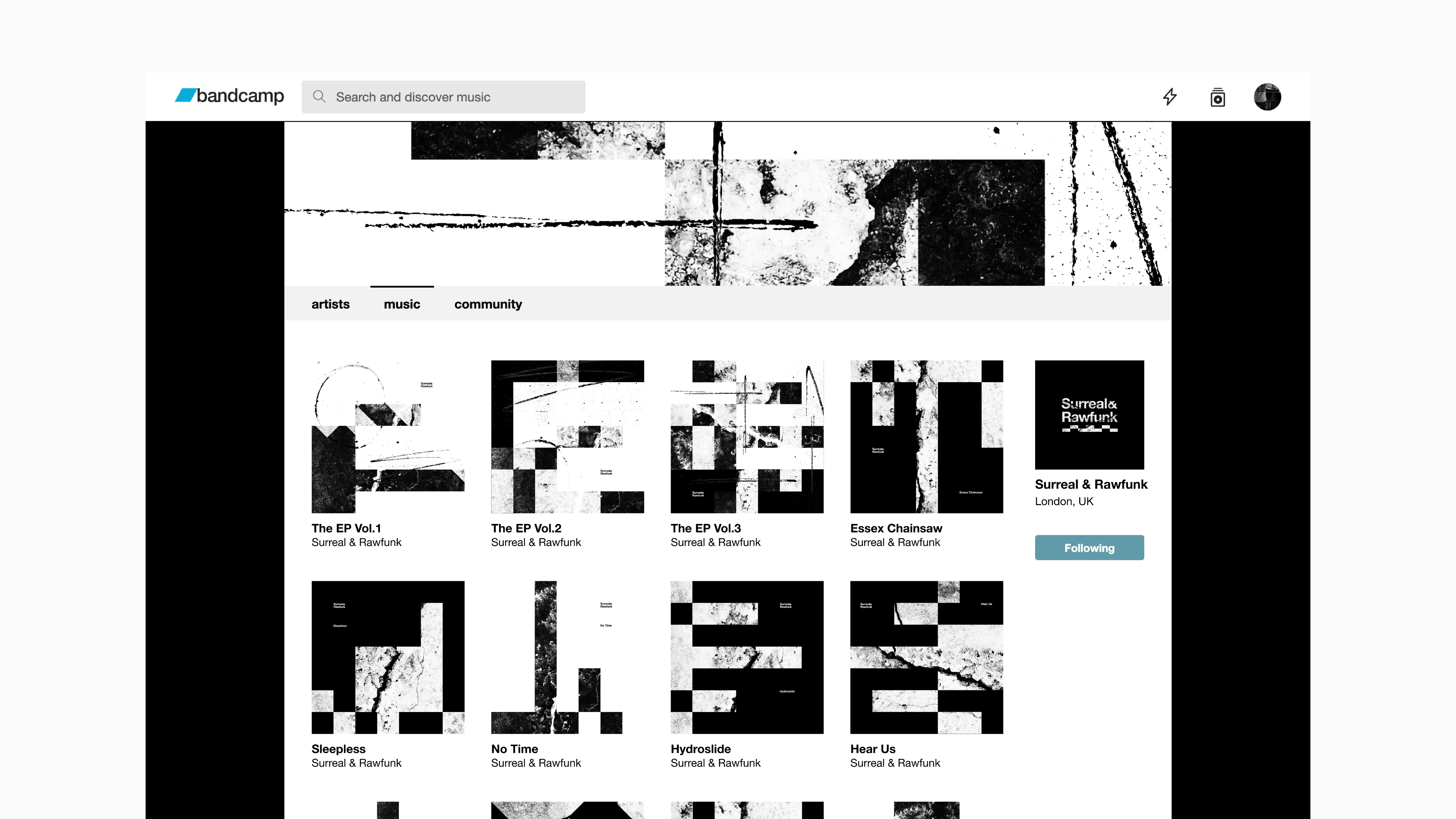
The identity in action
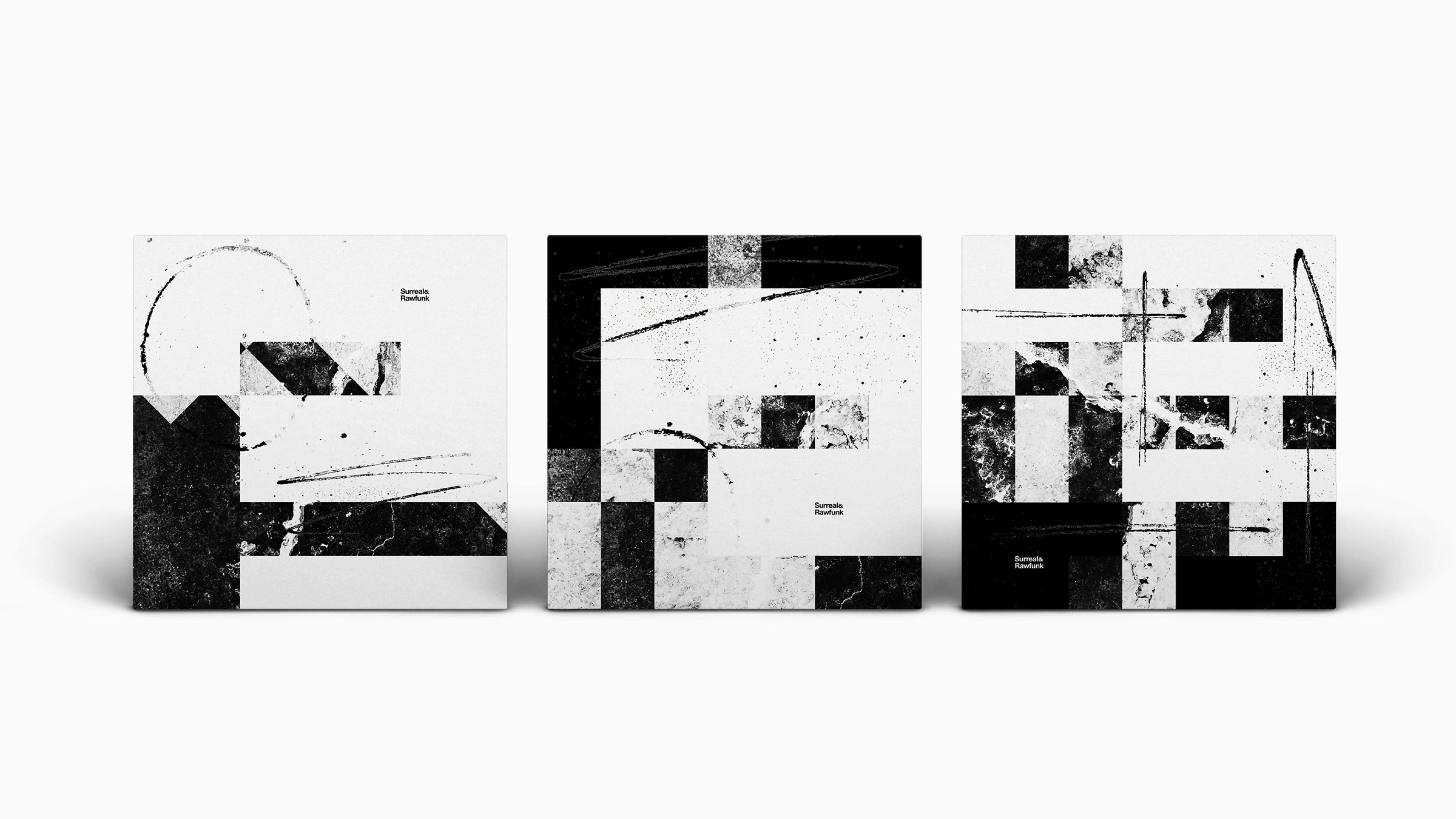
The identity was designed as a dynamic toolkit of design elements, capable of representing a wide spectrum of Drum & Bass styles—from minimal, clean, and polished to heavy, distorted, and chaotic.
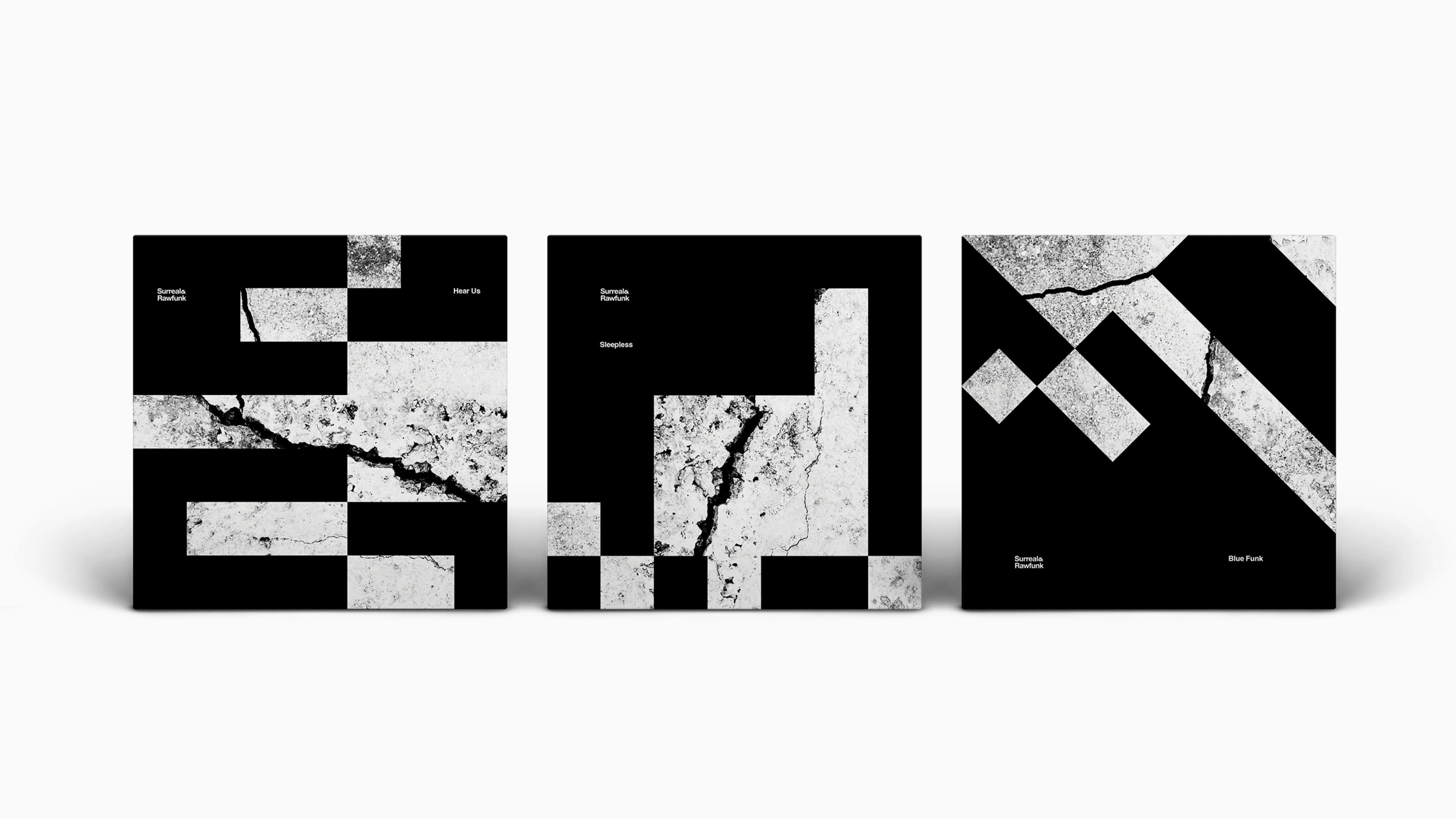
The influence of Morse code informed the structural basis of many of the designs, using strong grids and clear, ordered layouts.
As the identity becomes more expressive and moves beyond static applications, textured, hand-drawn elements take prominence, emphasising movement and rhythm and introducing a more natural, human quality.
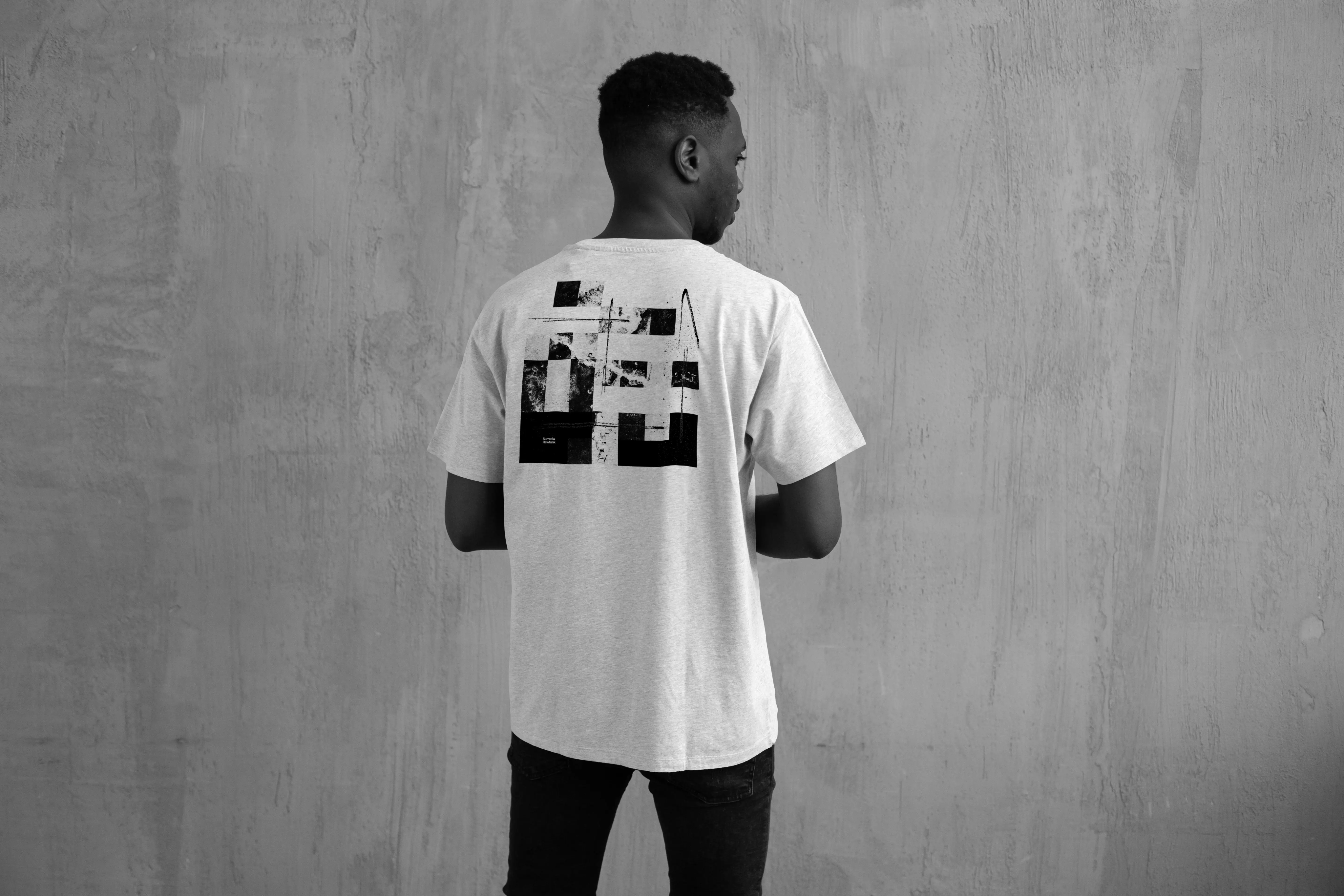
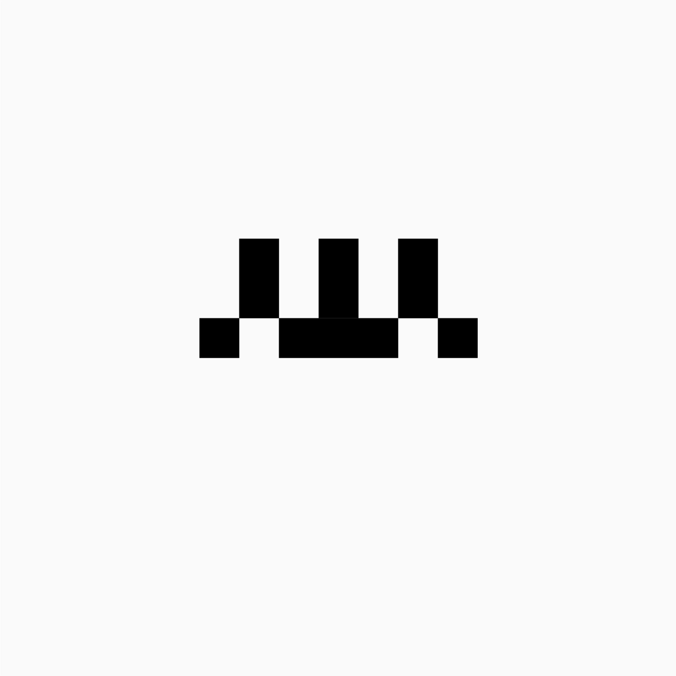
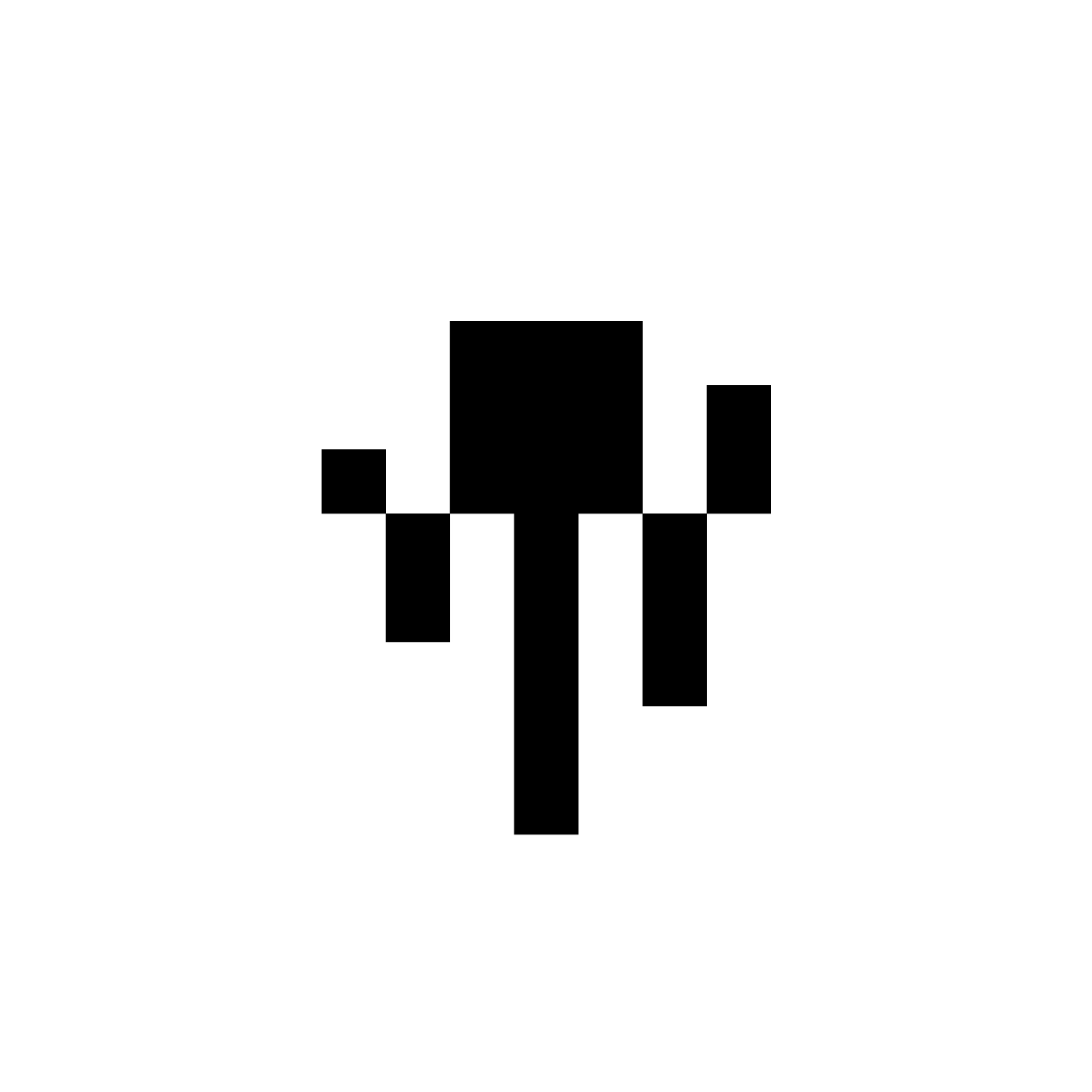
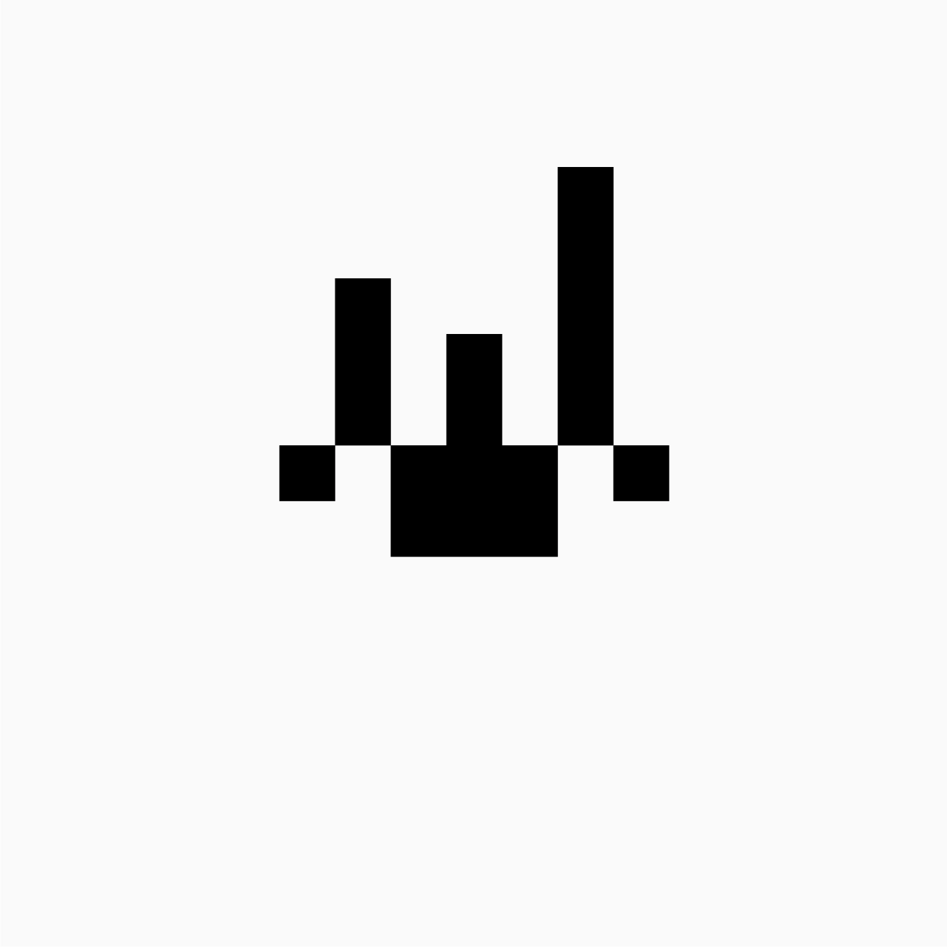
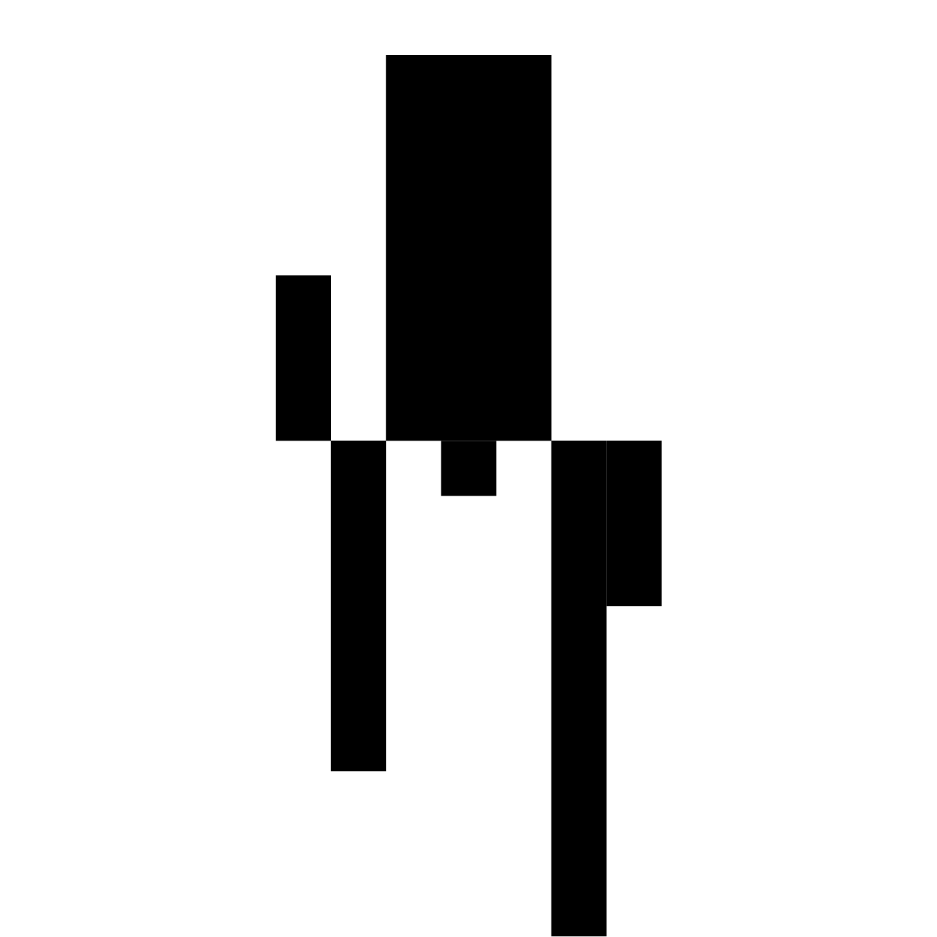
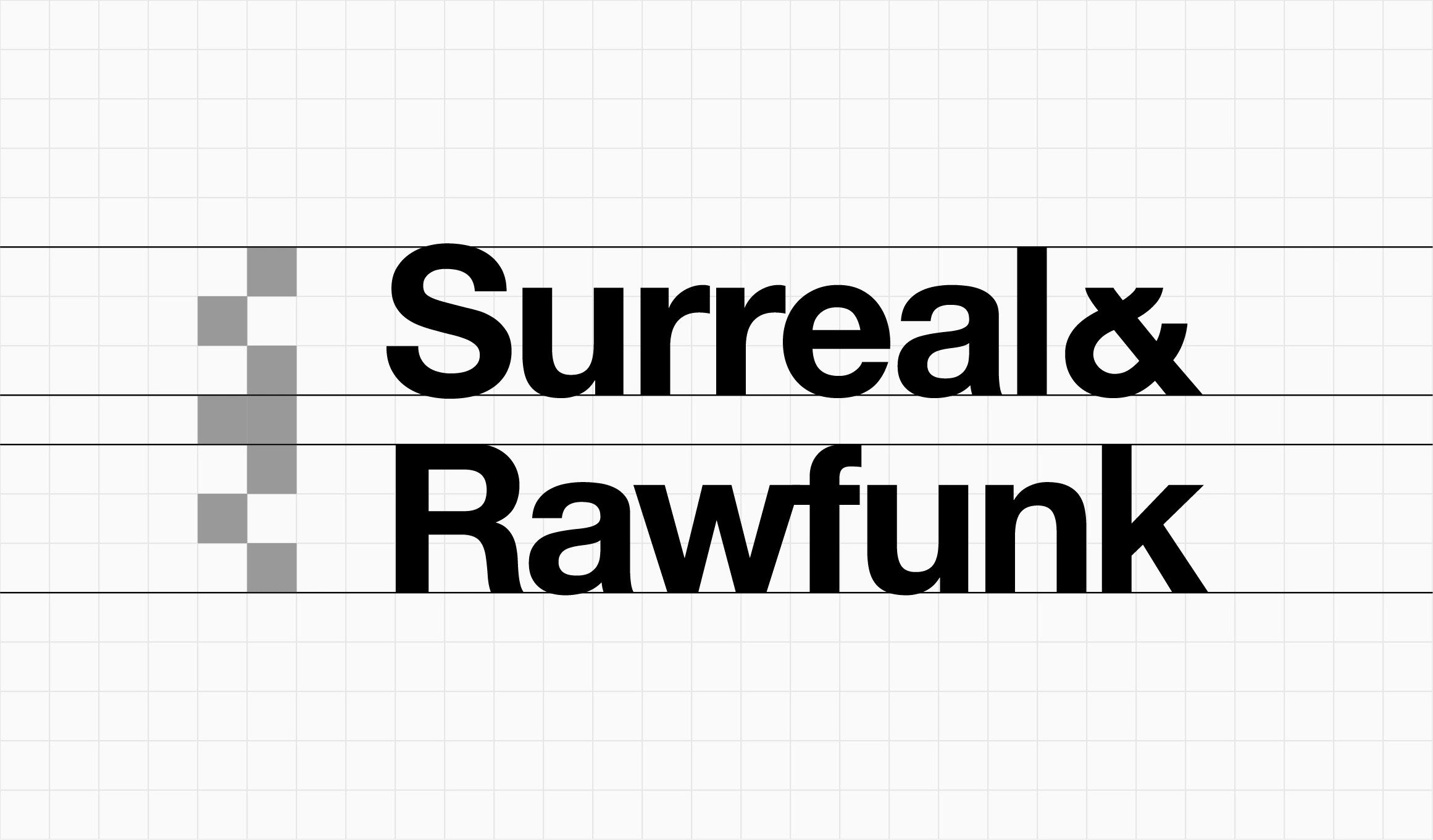
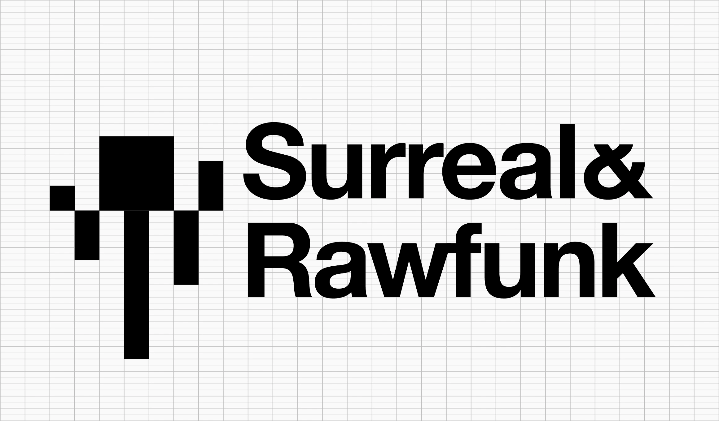
Dynamic logo mark
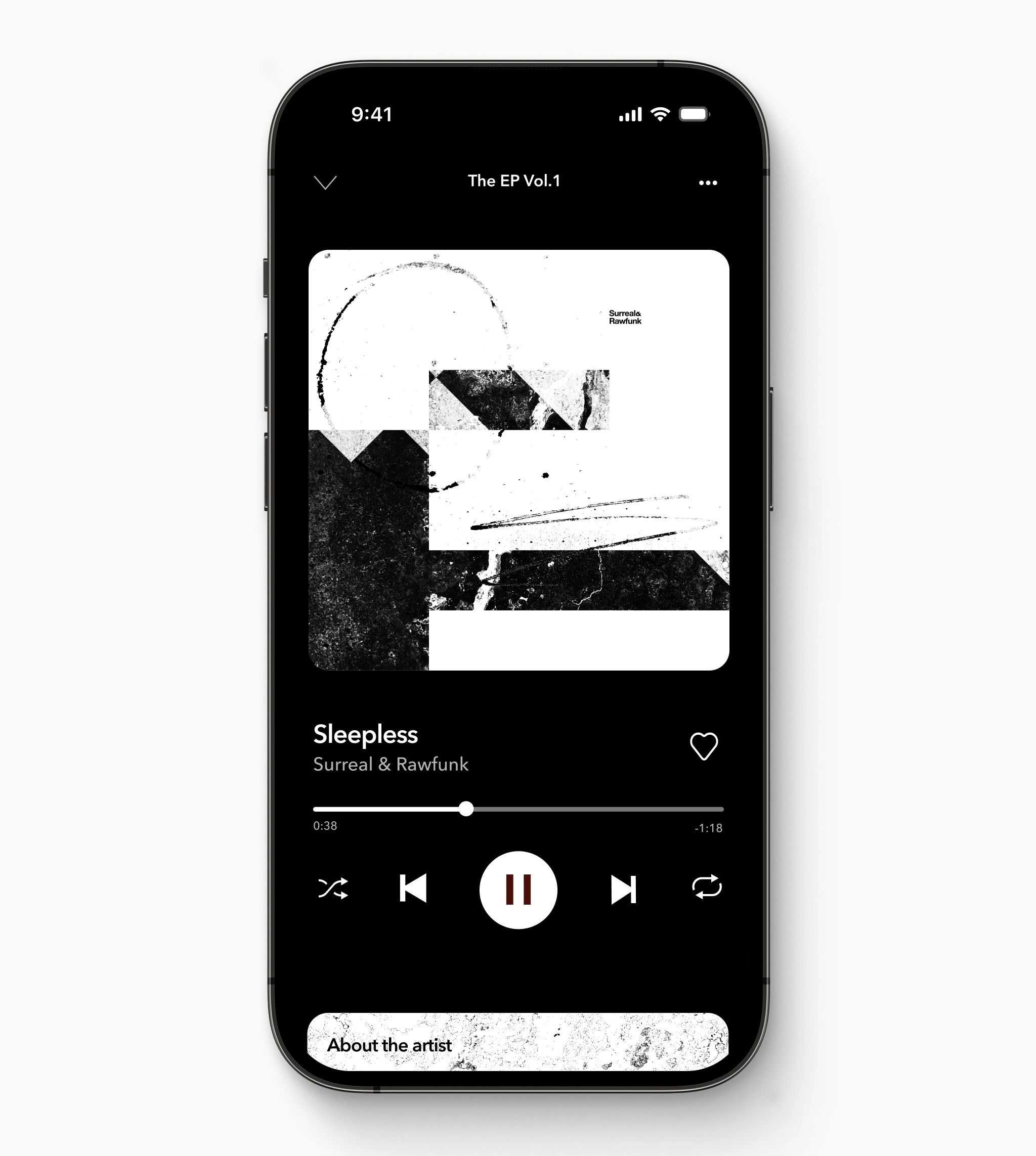
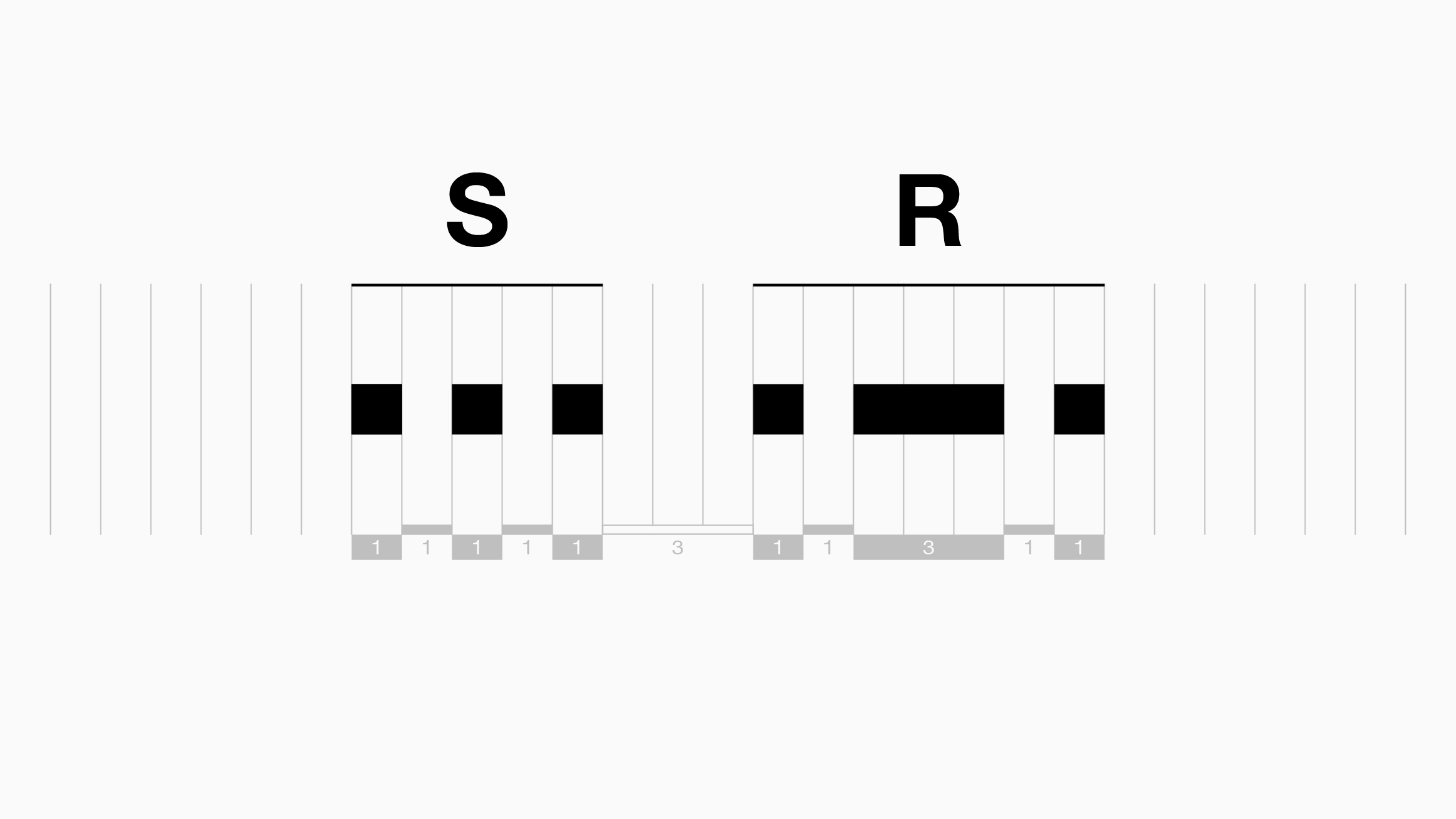
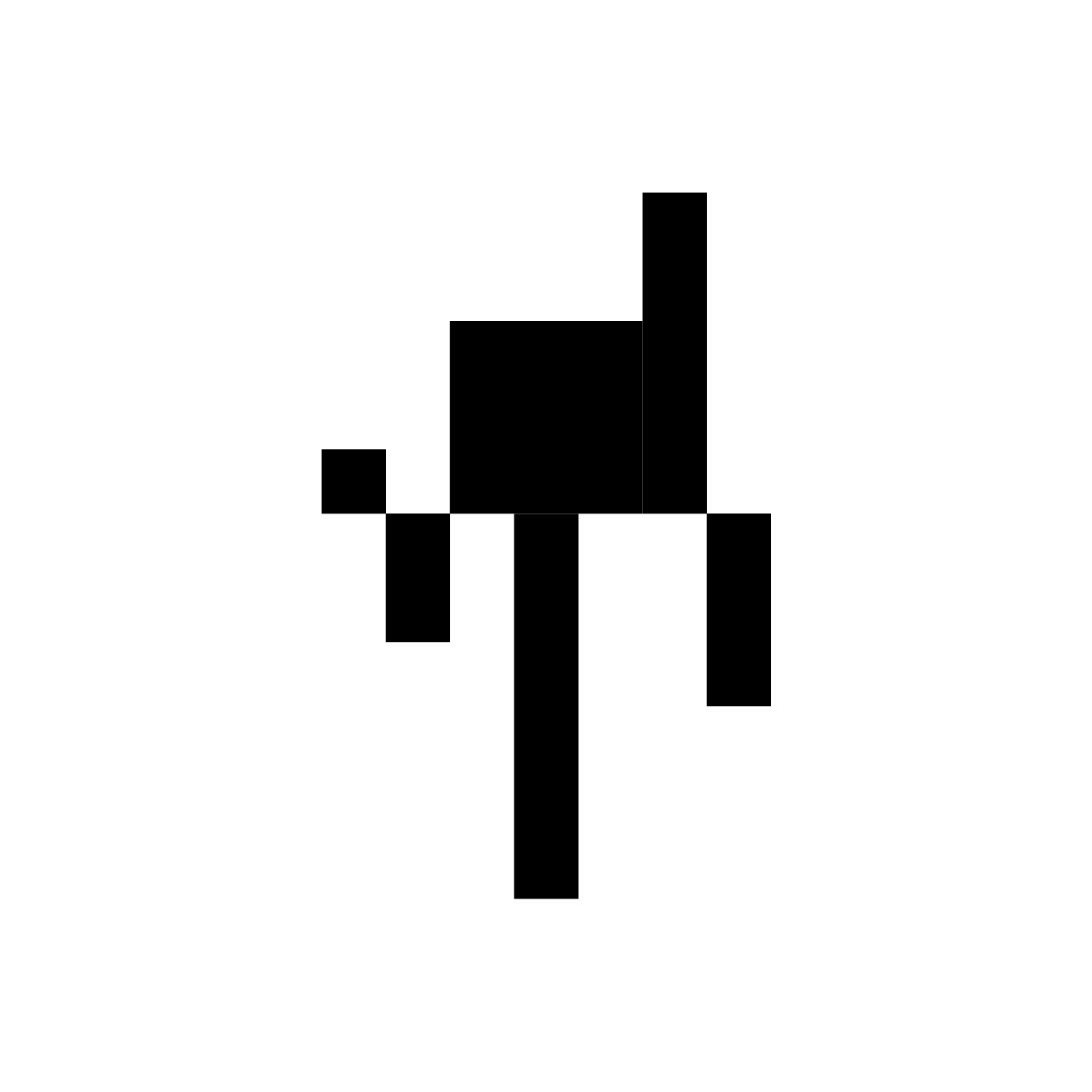
The logo mark combines the Morse code representations of ‘S’ and ‘R’ into a dynamic symbol that can adapt and respond depending on context—similar to how an audio meter reacts to incoming sound. More abstract iterations of the mark can be used as structural elements, informing composition, grids, positioning, and spacing.

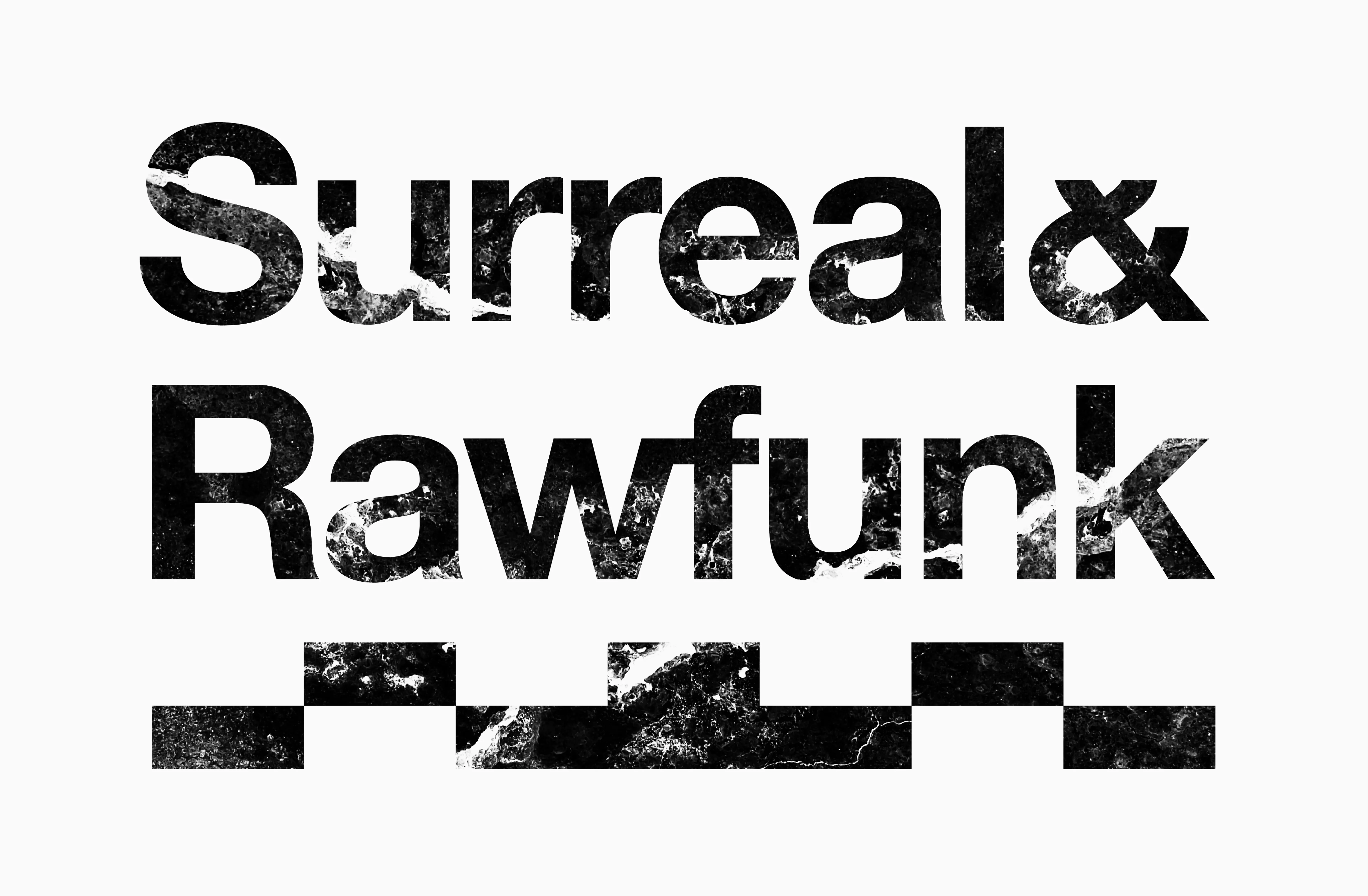
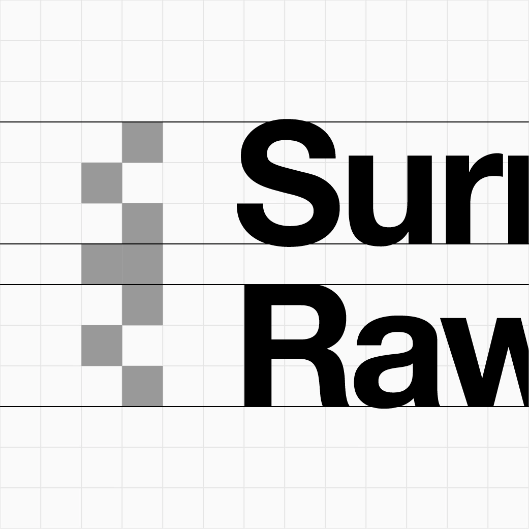
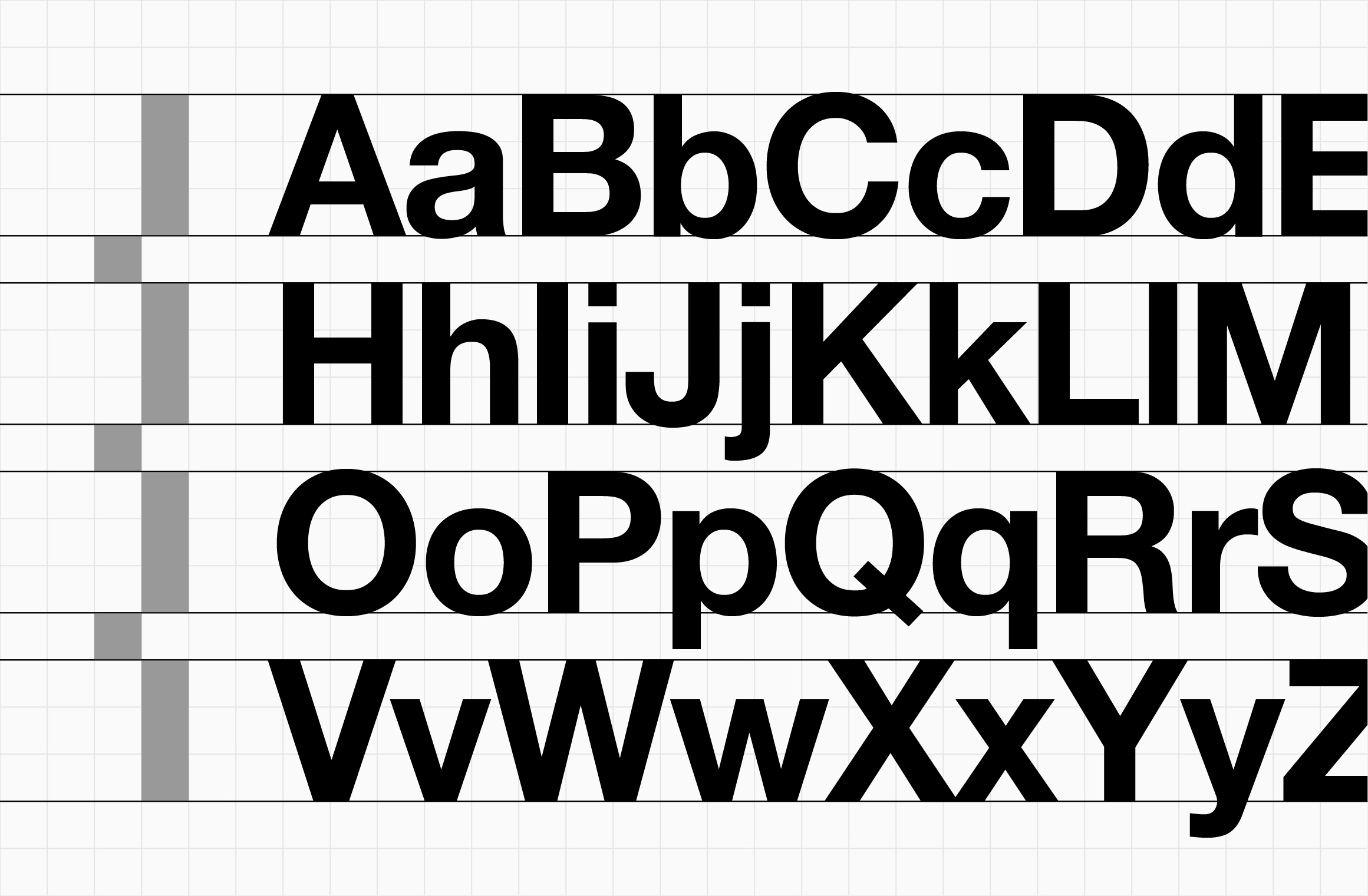
Utilitarian typography
Helvetica was chosen for its utilitarian and functional qualities, reflecting the need for clarity, legibility, and simplicity when sending and receiving Morse code messages.
The timing scale of Morse code informed the typographic spacing. The one-unit and three-unit measurements used to construct the ‘S’ and ‘R’ were mapped to cap height and line height, creating visual synergy between the dynamic marks and typography while maintaining flexibility across applications.
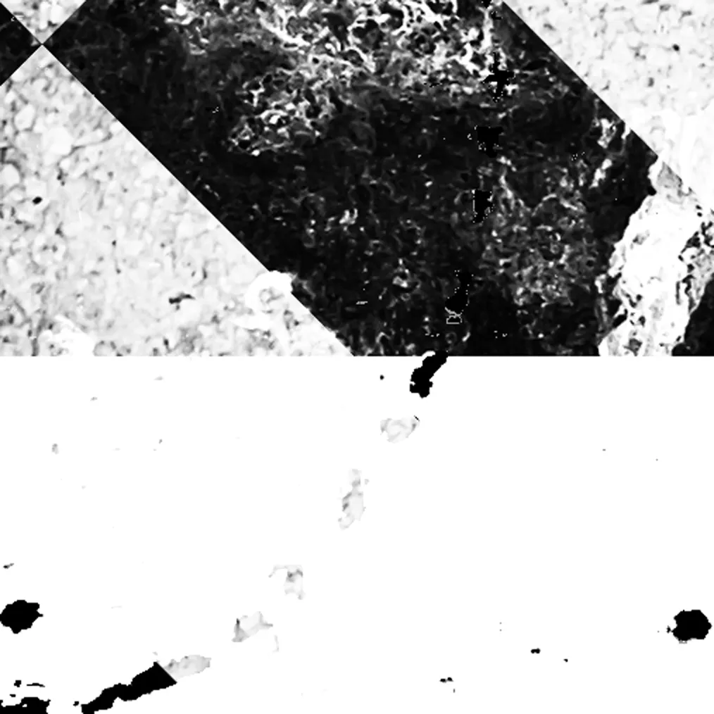
Contrasting colour
Colour was further inspired by Morse code. High-contrast black and white were chosen to reflect the binary on/off nature of the signal, as well as the clarity and simplicity of Morse code. Mid tones created through the use of overlapping textures help to add visual interest without diluting the concept.
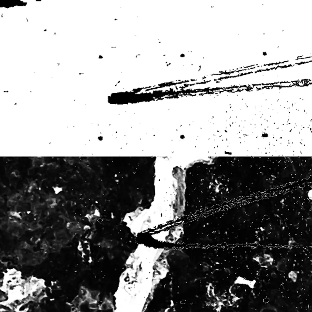
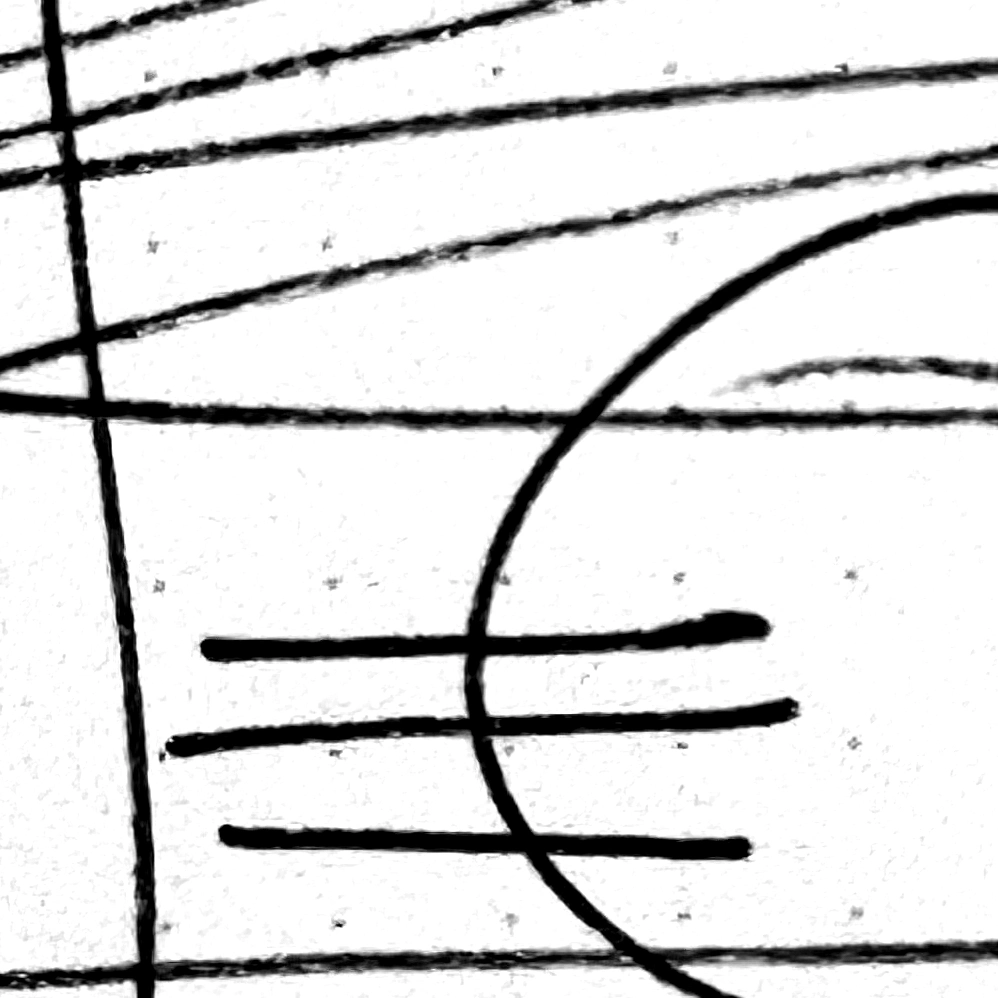
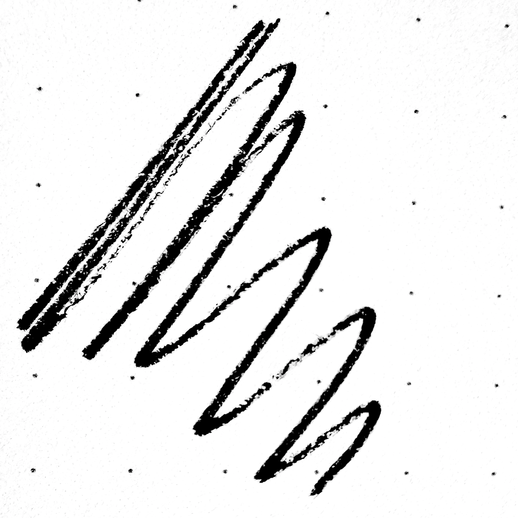
Expressive marks
Hand-drawn marks on rough notepaper reference the telegraphist recording messages, emphasising the human element of the process and each operator’s unique sending style, or ‘fist’.
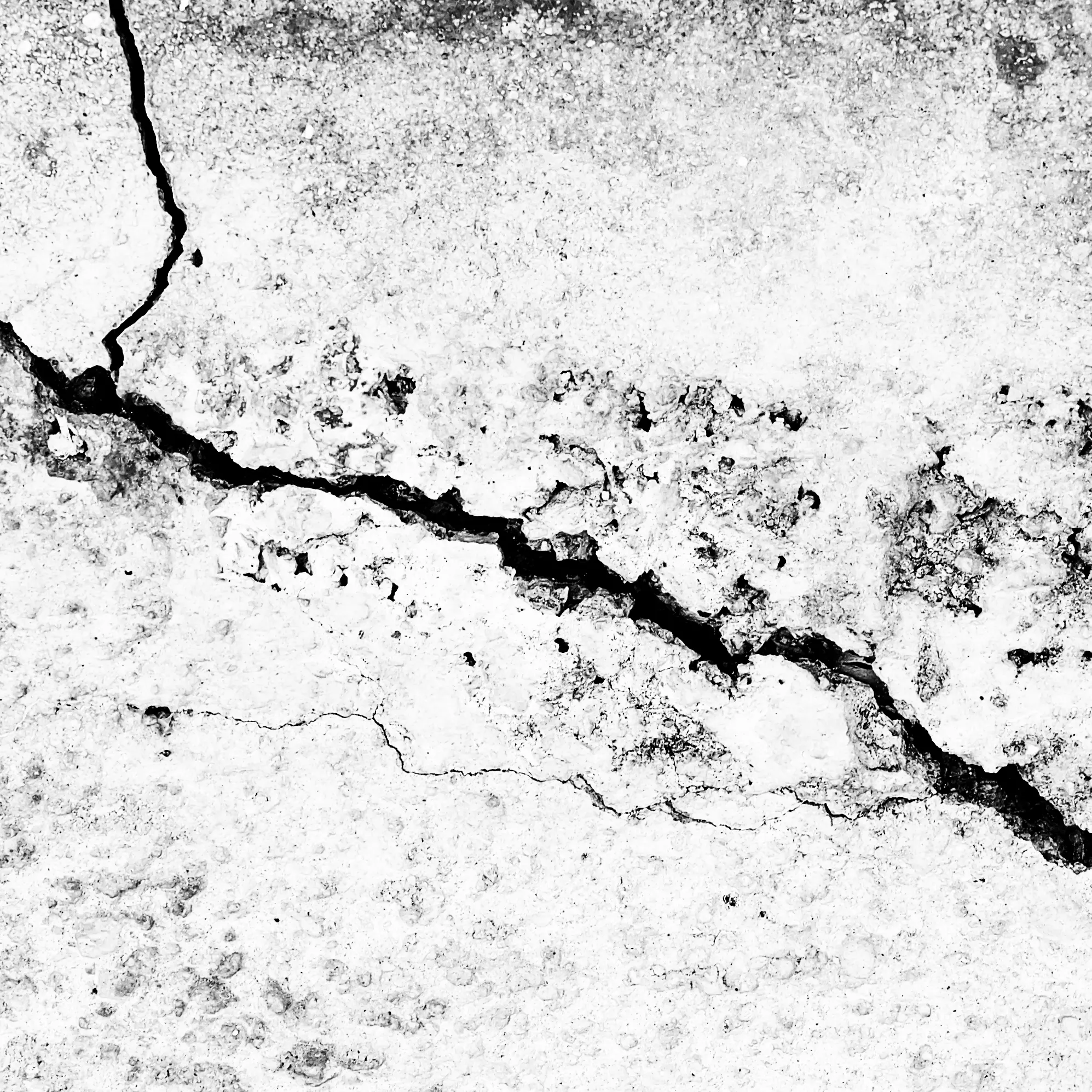
Broken concrete was introduced to represent the strength and power of the music—its weight capable of cracking even the strongest material.
Edd Hopkinson
Senior Designer
Surreal & Rawfunk visual identity
Creating an expressive visual identity that represents the artists and sound sympathetically.
Creative Concept
Visual Design
Visual Identity
Collaboration
Completed @ Freelance
Challenge
Drum & Bass production duo Surreal & Rawfunk wanted a visual identity that reflected the strength and power of their music while retaining a simple, recognisable aesthetic.
Concept
The identity is built around the idea of translating sound into a visual language. Morse code became a key reference point, as it was one of the earliest systems to convert audio into something readable. Rather than using Morse code directly, its principles were used as a starting point to develop a flexible visual system that can be used to respond to different intensities and moods within the music.
By linking audio cues to graphic form, the identity creates a clear connection between sound and image, ensuring the visual language feels embedded in the music rather than applied afterwards.
The identity in action
The identity was designed as a dynamic toolkit of design elements, capable of representing a wide spectrum of Drum & Bass styles—from minimal, clean, and polished to heavy, distorted, and chaotic.
The influence of Morse code informed the structural basis of many of the designs, using strong grids and clear, ordered layouts.
As the identity becomes more expressive and moves beyond static applications, textured, hand-drawn elements take prominence, emphasising movement and rhythm and introducing a more natural, human quality.
Dynamic logo mark
The logo mark combines the Morse code representations of ‘S’ and ‘R’ into a dynamic symbol that can adapt and respond depending on context—similar to how an audio meter reacts to incoming sound. More abstract iterations of the mark can be used as structural elements, informing composition, grids, positioning, and spacing.
Utilitarian typography
Helvetica was chosen for its utilitarian and functional qualities, reflecting the need for clarity, legibility, and simplicity when sending and receiving Morse code messages.
The timing scale of Morse code informed the typographic spacing. The one-unit and three-unit measurements used to construct the ‘S’ and ‘R’ were mapped to cap height and line height, creating visual synergy between the dynamic marks and typography while maintaining flexibility across applications.
Contrasting colour
Colour was further inspired by Morse code. High-contrast black and white were chosen to reflect the binary on/off nature of the signal, as well as the clarity and simplicity of Morse code. Mid tones created through the use of overlapping textures help to add visual interest without diluting the concept.
Expressive marks
Hand-drawn marks on rough notepaper reference the telegraphist recording messages, emphasising the human element of the process and each operator’s unique sending style, or ‘fist’.
Broken concrete was introduced to represent the strength and power of the music—its weight capable of cracking even the strongest material.