Edd Hopkinson
Senior Designer
Morrisons Web Redesign
A conceptual framework for a unified Morrisons digital experience, integrating shopping and editorial content while providing reference designs for evolving the brand’s digital guidelines.
Creative Concept
UX/UI
Content Design
Guidelines
Completed @ M-Digital
Challenge
Morrisons entered online retail behind their competitors, resulting in two disconnected sites: one for content (recipes, store info, competitions, and editorial) and another for shopping via Ocado’s platform. This split created a fragmented customer experience. The challenge was to unify both journeys into a single, seamless experience integrating products with relevant content and giving customers one destination to shop, browse, and engage with the brand.
Objective
The objective was to unify both journeys into a single, seamless experience integrating products and content and giving customers one destination to shop, browse, and engage with the brand.
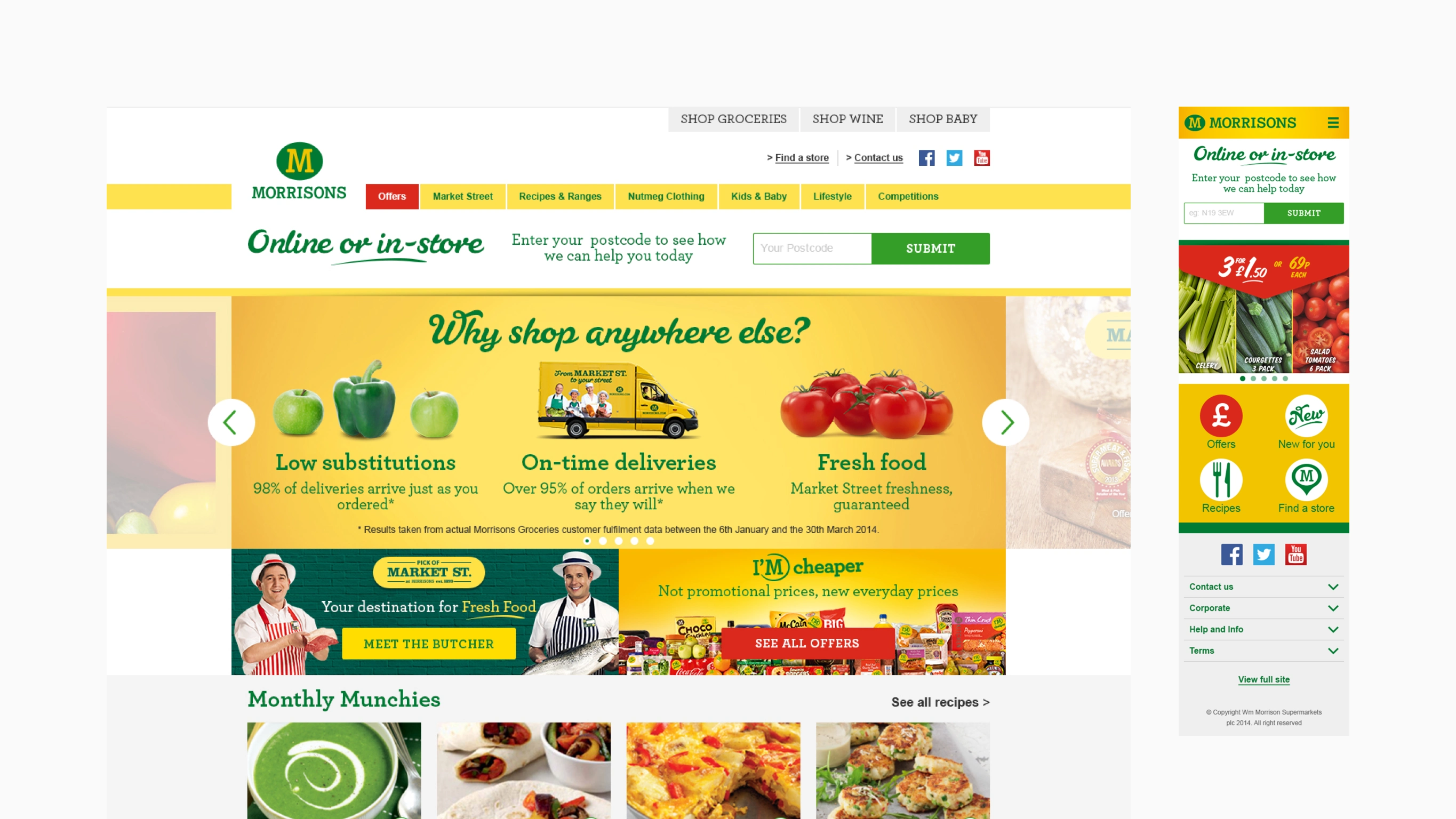
Creating a single destination for content and products
Morrisons’ core strengths lie in fresh produce and in-store specialist knowledge. Market Street experts guide customers with advice, suggestions, and recipe ideas at the point of purchase. I translated that same helpful, conversational experience online—connecting product discovery with rich produce storytelling to strengthen the Morrisons brand.
The homepage gives customers a clear snapshot of everything Morrisons offers: recipe inspiration, offers, and editorial content, all reinforced by customer-focused brand promises.
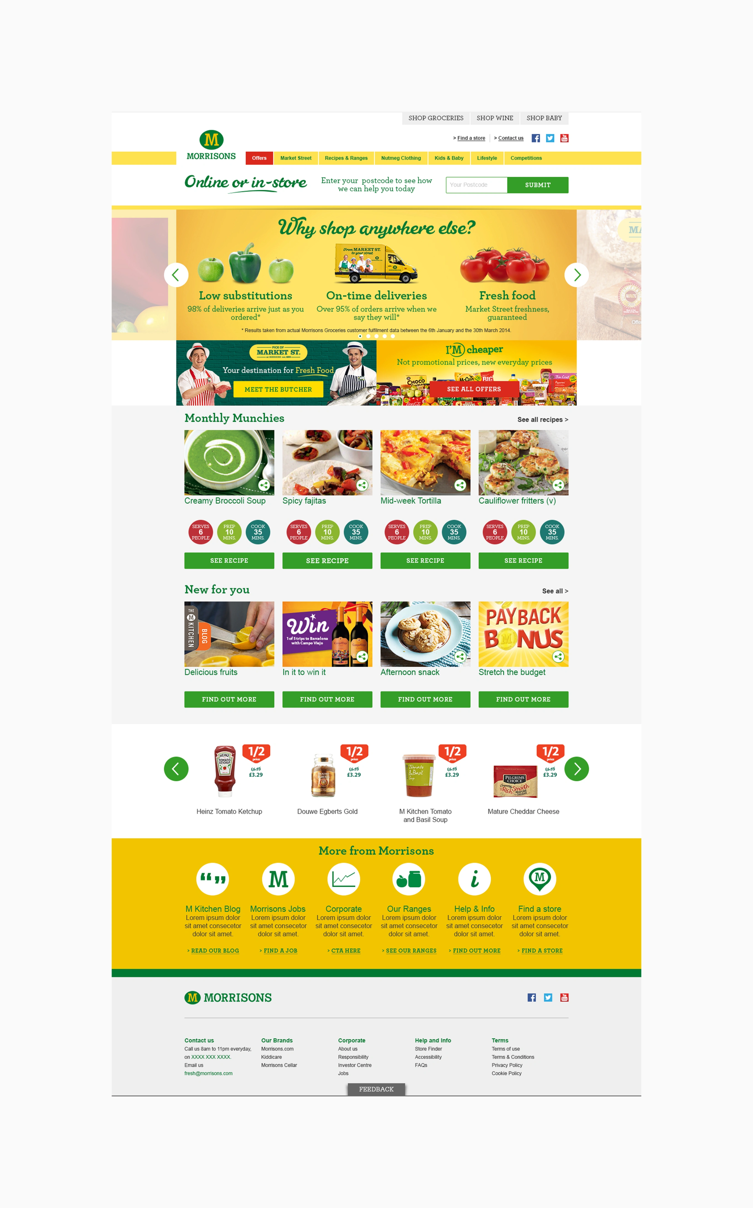
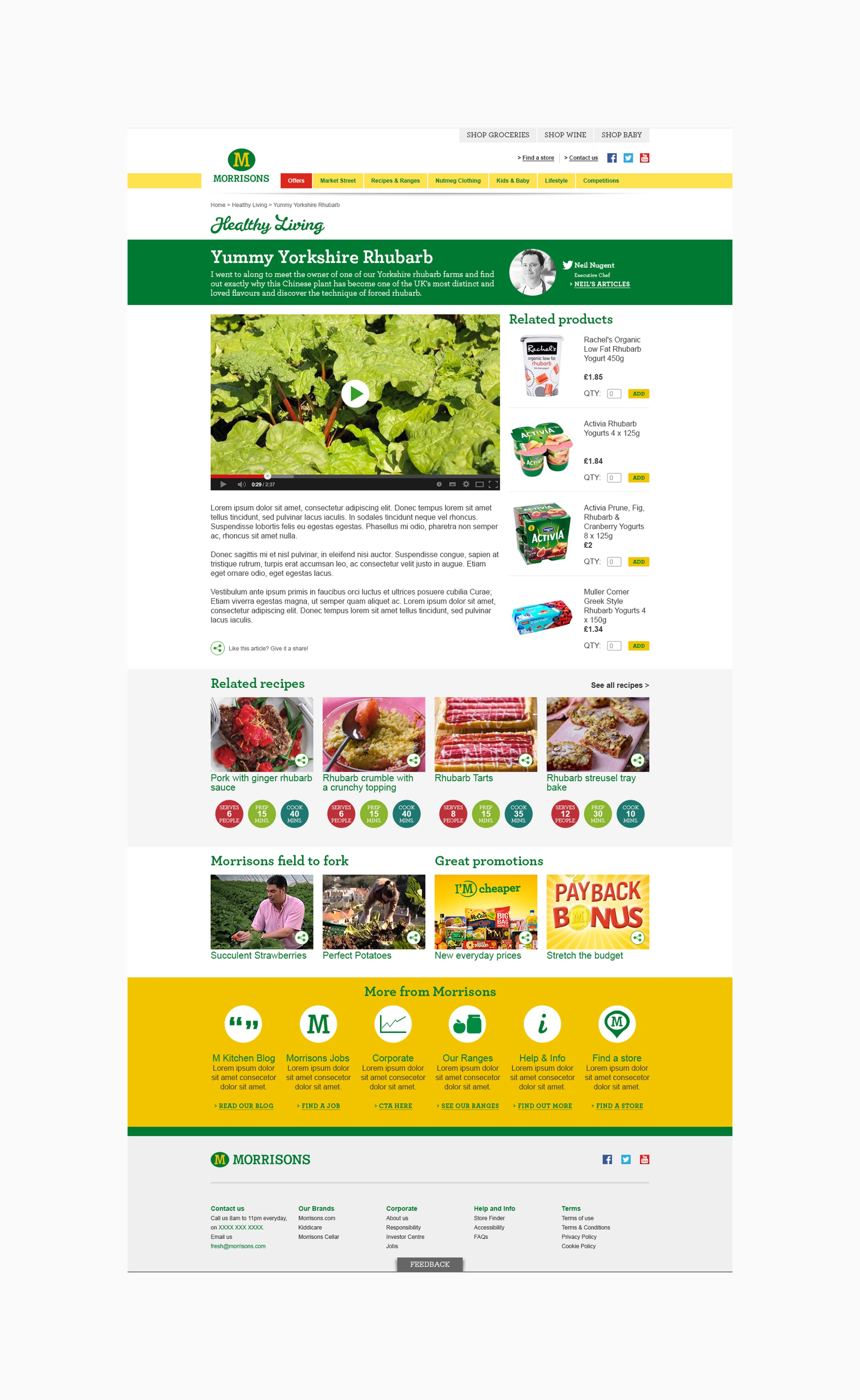
Joining related products to produce stories
Editorial pages highlight Morrisons’ ‘field to fork’ stories, showcasing where fresh produce comes from and how the business supports farmers. I connected these stories with related products and recipes, mirroring the way in-store experts guide customers toward informed produce and product choices.
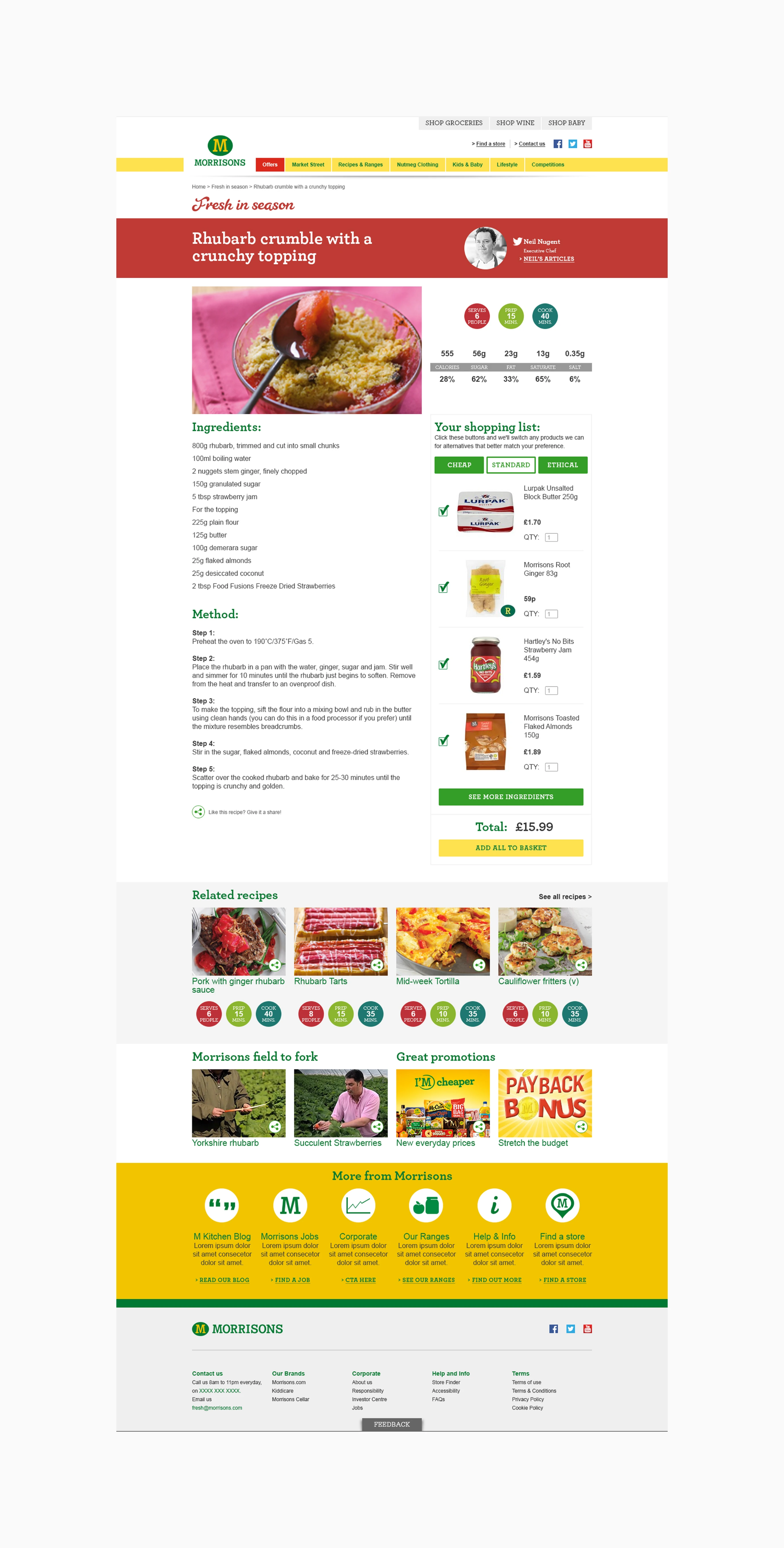
Streamlining recipe shopping
To further unify the experience, recipe pages included pre-populated shopping lists with three product tiers, allowing customers to shop directly from the recipe without interrupting their browsing journey.
Edd Hopkinson
Senior Designer
Morrisons Web Redesign
A conceptual framework for a unified Morrisons digital experience, integrating shopping and editorial content while providing reference designs for evolving the brand’s digital guidelines.
Creative Concept
UX/UI
Content Design
Guidelines
Completed @ M-Digital
Challenge
Morrisons entered online retail behind their competitors, resulting in two disconnected sites: one for content (recipes, store info, competitions, and editorial) and another for shopping via Ocado’s platform. This split created a fragmented customer experience. The challenge was to unify both journeys into a single, seamless experience integrating products with relevant content and giving customers one destination to shop, browse, and engage with the brand.
Objective
The objective was to unify both journeys into a single, seamless experience integrating products and content and giving customers one destination to shop, browse, and engage with the brand.
Creating a single destination for content and products
Morrisons’ core strengths lie in fresh produce and in-store specialist knowledge. Market Street experts guide customers with advice, suggestions, and recipe ideas at the point of purchase. I translated that same helpful, conversational experience online—connecting product discovery with rich produce storytelling to strengthen the Morrisons brand.
The homepage gives customers a clear snapshot of everything Morrisons offers: recipe inspiration, offers, and editorial content, all reinforced by customer-focused brand promises.
Joining related products to produce stories
Editorial pages highlight Morrisons’ ‘field to fork’ stories, showcasing where fresh produce comes from and how the business supports farmers. I connected these stories with related products and recipes, mirroring the way in-store experts guide customers toward informed produce and product choices.
Streamlining recipe shopping
To further unify the experience, recipe pages included pre-populated shopping lists with three product tiers, allowing customers to shop directly from the recipe without interrupting their browsing journey.
Edd Hopkinson
Senior Designer
Morrisons Web Redesign
A conceptual framework for a unified Morrisons digital experience, integrating shopping and editorial content while providing reference designs for evolving the brand’s digital guidelines.
Creative Concept
UX/UI
Content Design
Guidelines
Completed @ M-Digital
Challenge
Morrisons entered online retail behind their competitors, resulting in two disconnected sites: one for content (recipes, store info, competitions, and editorial) and another for shopping via Ocado’s platform. This split created a fragmented customer experience.
Objective
The objective was to unify both journeys into a single, seamless experience integrating products and content and giving customers one destination to shop, browse, and engage with the brand.
Creating a single destination for content and products
Morrisons’ core strengths lie in fresh produce and in-store specialist knowledge. Market Street experts guide customers with advice, suggestions, and recipe ideas at the point of purchase. I translated that same helpful, conversational experience online—connecting product discovery with rich produce storytelling to strengthen the Morrisons brand.
The homepage gives customers a clear snapshot of everything Morrisons offers: recipe inspiration, offers, and editorial content, all reinforced by customer-focused brand promises.
Joining related products to produce stories
Editorial pages highlight Morrisons’ ‘field to fork’ stories, showcasing where fresh produce comes from and how the business supports farmers. I connected these stories with related products and recipes, mirroring the way in-store experts guide customers toward informed produce and product choices.
Streamlining recipe shopping
To further unify the experience, recipe pages included pre-populated shopping lists with three product tiers, allowing customers to shop directly from the recipe without interrupting their browsing journey.